CHANCE News 12.02
|
Team |
Odds |
Probability |
| Miami Heat | 10 to 1 |
.091 |
| Memphis Grizzlies | 8 to 1 |
.111 |
| Atlanta Hawks | 7 to 1 |
.125 |
| Los Angeles Clippers | 5 to 1 |
.167 |
| Denver Nuggets | 7 to 2 |
.222 |
| Toronto Raptors | 3 to 1 |
.25 |
| Cleveland Cavaliers | Even |
.5 |
| Total | 1.466 |
What Ballard didn't understand, of course, is that odds are equivalent
to probabilities (this is the same point John Allen Paulos made in his
June
28, 2001, column on William Safire's mistaken odds that different
Democrats would be nominated for President in 2004. When we determine
these probabilities from the odds we find a total probability that one
of these teams finishes last of 1.466, which is of course impossible.
I sent a letter to SI about this, but it wasn't printed.
Of course, Jeff is correct in this context, but if these were odds given by Roxy for Las Vegas betting, the corresponding probabilities would also add up to more than one since that is how bookies make money. For example, here are the odds (as of 1 May 2003) from Roxy's Americasline.com for betting on who will be elected president in 2004:
ODDS TO BE ELECTED PRESIDENT OF THE UNITED STATES IN 2004
| Name | Party |
Title |
Odds |
| George W. Bush | (R) |
President | 3/5 |
| John Kerry | (D) |
Massachusetts Senator | 4/1 |
| Joe Lieberman | (D) |
Connecticut Senator | 7/1 |
| John Edwards | (D) |
North Carolina Senator | 15/1 |
| Dick Gephardt | (D) |
Missouri Congressman | 20/1 |
| Howard Dean | (D) |
Former Vermont Governor | 25/1 |
| Bob Graham | (D) |
Florida Senator | 25/1 |
| Hillary Clinton | (D) |
New York Senator | 50/1 |
| Joe Biden | (D) |
Delaware Senator | 50/1 |
| Westly Clark | (D) |
Former NATO Commander | 100/1 |
| Gary Hart | (D) |
Former Colorado Senator | 150/1 |
| Carol Moseley-Braun | (D) |
Carol Moseley-Braun | 250/1 |
| Dennis Kucinich | (D) |
Ohio Congressman | 250/1 |
| Ralph Nader | (G) |
Consumer advocate | 500/1 |
| Al Sharpton | (D) |
Civil rights activist | 1000/1 |
Converting these odds to probabilities we found that they sum to 1.2. Those who set odds for betting usually assume that the proportion of money bet on an outcome is a good estimate for the probability that the outcome will occur. Assuming this is the case, then the probabilities would add up to 1. If these probabilities were used to create the odds, then the expected profit would be $0.
On the other hand, if we multiply the probabilities by 1.2, making their sum 1.2, and use these to determine the odds, the expected profit will be about 17% of the money bet which is about what bookies want.
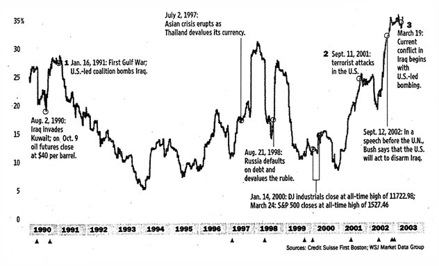
We found it interesting that, during the Iraq war, even the chance news items often involved issues related to the war. We decided to limit this issue of Chance News primarily to such items. However, we remind readers that the monthly electronic newsletter STATS also discusses current chance items. At their website you can also request to receive an e-mail message with links to important recent articles when the next issue comes out.
We also remind readers of John Paulos' monthly column for ABCNews.com.
His
current column "Beauty is in the Wallet
of the Beholder" relates the stock market, beauty contests, and a
simple game. Previous columns are archived
on the ABCnews website. The March and April columns, Assessing
Military Edge, and Polls,
a Proverb and the Price were motivated by the Iraq war.
Our first war related story was suggested by Mark Rizzardi.
http://www.sfgate.com/rallycount/.
San Francisco Chronicle, 21 Feb. 2003, A1
Wyatt Buchanan
The crowd
count conumdrum.
San Francisco Bay Area Independent Media Center, 1 March, 2003.
Peter Maiden
40,000? 250,000?
Making crowd estimates a mix of guesswork, science, politics.
San Jose Mercury News, 28 Jan. 2003, Science & Health 1F
Isa M. Krieger
The problem of estimating the number of people in a crowed has often led to controversies. For example, as reported in Chance News 4.17, for the 1995 Louis Farrakhan's Million Man March on Washington, the Park Service estimated the crowd at 400,000 while an analysis by the Boston University's Center for Remote Sensing, based on computer enhancements of photographs, estimated the crowd at 870,000 with a margin of error of 25%. This led to the threat of a law suit by Farrakhan, and to the Park Service giving up estimating crowd sizes.
The Chronicle article discusses the problems encountered estimating crowd size at a rally protesting a war with Iraq held in San Francisco on Sunday Feb 16. There had been two previous rallys, October 26, 2002 and January 18, 2003 in the same area. In Peter Maiden's article we find the following history of the estimates for these previous marches.
In the October rally. the organizers estimated there were 100,000 protesters. The police estimated the number to be 25-40,000 and this is what was presented in the media. This seemed like too big a discrepancy and so the organization ANSWER hired a helicopter to take pictures at the next rally. This occurred on January 18th and Peter Maiden took the photos which were then posted on the Indymedia website. For this rally, the police first estimated 55,000 protesters. A chronicle reporter showed the police the photographs from the Indymedia website. As a result they increased their estimate to 150,000 with the excuse that they had estimated the count for those at the City Plaza but not for those on Market street. In her article, Krieger described two more "mathematical" methods of estimation that were carried out during this rally as follows:
Method 1: Assign someone to a spot on the sidewalk with the job of counting the number of marchers who pass in one minute. Then multiply this sum by the number of minutes it takes for all marchers to pass that spot. This was the approach taken by ANSWER, the anti-war march organizer, said spokesman Bill Hackman. He says they counted 1,000 people a minute for 180 minutes-- for a total of 180,000 marchers.
Method 2: Measure the square meters of the area, then divide by crowd density. This was the method used by Chandler, who has degrees in physics and math. He went home after the march and used aerial images to calculate that Market Street is 34 meters wide and the parade route was 2.7 kilometers long. The total area of the parade route, not counting Civic Center Plaza, was 92,000 square meters, he concluded. He estimated that each square meter of space is occupied by 1.5 people. So he concluded that the total number of marchers on Market Street, when filled, was 138,000. He said that marchers filled the parade route twice so he doubled this number concluding that there were more than 250,000 marchers.
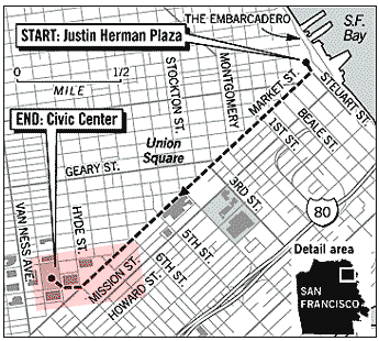
In February, ANSWERS and others planned another San Francisco rally which took place February 16 along the same route as the previous marches: down Market Street ending at the Civic Center Plaza as indicated in the following graph provided on the Chronicle's website.
One can get a good idea how difficult the estimation problem is from the following picture taken by Peter Maiden of the crowd just in the Civic Center Plaza
and this picture taken by Darryl Bush, taken for the Chronicle, of the march on Market street.
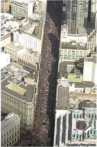
Remarkably, after this march the organizers, the police and the mainstream media agreed on a crowd count of about 200,000 people.
Anticipating that the estimates would be made by observational methods they felt to be unreliable, the Chronicle had arranged to have a more scientific estimate for this march. They hired the Air Flight Service, a company with a great deal of experience in taking photographs for topographical maps, to take aerial photographs directly above Market Street and the Civic Center. The photographs made possible a discrete count of individuals and provided a view of the spaces between them. On its website, the Chronicle describes the methodology used to estimate the crowd size from the photographs as follows:
The aerial photographs of Sunday's anti-war march were taken at a time believed by organizers to be close to the peak of the march. The plane made a pass over the length of Market Street and the Civic Center area, taking contiguous photographs. The lens in the camera looked directly down from 2,000 feet.
Air Flight Service produced 9-by-9-inch black and white negatives,
which were enlarged into prints with enough clarity to define individuals
on the street. They then applied a grid pattern to the prints to provide
units in which the marchers could be counted. The entire length of
the 1.75-mile route is visible in the images. Because the density
of the crowd varied over the route, the grids were sorted into five
categories - 100 percent, 75 percent, 50 percent, 25 percent and 10
percent filled with people. This was done by visual estimates. Each
of the nearly 300 grids was given a colored dot representing these
percentages.
At this point, the hand counting began. A representative sample of
grids for each density was selected. For instance, eight 50 percent
grids were counted, eight 25 percent grids were counted and so forth.
The totals for each group were examined to ensure there were not extreme
deviations. This tested the original visual estimate that had assigned
grids to density groups. If necessary, a sample grid's category was
changed to reflect the count.
Here is a grid for which that was estimated to be 75% full.
An average number of people for each density grid was established using the sample groups. Air Flight Service then tallied the grids to come up with a total of nearly 65,000 people visible from the air at the moment the photographs were shot. The company said the margin of error is 10 percent.
The Chronicle article comments:
Calculating a precise number of protesters for the entire rally is not possible from this survey, but the result is much more accurate than the visual scan method most commonly used by police and organizers.
The Chronicle emphasized that their count was only of the number in the protest at the peak time but did not count those who entered before or left after this time. However, they said that their count of 65,000, significantly lower than the 200,000 estimate, was supported by information about public transportation. For example the Bay Area Rapid Transit System determined that 66,250 exited at the four downtown stations closest to the rally on Sunday between 8 a.m. and midnight, around 43,000 more than the number of downtown passengers last Sunday.
Of course the number of protestors is an important political statement, so one might hope that the media would try to get it right. However, before the Chronicle analysis was reported, the crowd size was routinely reported as 200,000 with no reference to any justification for this number. Then, despite the care the Chronicle took to state that they counted only the number of protestors present at a particular time, when a UPI story was reported in the Washington Times on Feb. 19, we read:
The San Francisco Chronicle said high-resolution aerial photographs commissioned by the newspaper showed that around 65,000 people took part in last Sunday's march through downtown rather than the 200,000 announced originally.
They conveniently left out a statement in the UPI story that this was an estimate for the number of protesters at a specific time. Ironically Debra Sauders, who writes a column for the Chronicle, began her February 26th column "Does size matter?" with:
ANTI-WAR protesters bristled when The Chronicle reported last week that a mere 65,000 protesters showed up at San Francisco's Feb. 16 anti-war protest.
requiring the Chronicle to make a correction stating that they had only counted protestors who were there at a specific time.
DISCUSSION QUESTIONS:
(1) What's missing from the Chronicle estimate is the percentage
of protesters who are present at the peak time of the march. Do you have
any suggestions on how this percentage might be estimated?
(2) What do you think of the method used by the Air Flight Service? Can you suggest any improvements?
(3) Alex S. Jones, the director of Harvard University's Joan Shorenstein Center on the Press, Politics and Public Policy, and former reporter for the New York Times, said:
There's an old saying in journalism: People only see
what they believe.
This is an emotional issue, not a factual issue as far as most people
are concerned.
Why would the police like to see small numbers? Do you think the news media might also have a bias for low or high estimates?
Decisions, Decisions.
The New Yorker, 24 March, 2003, p 33
James Surovie
Betting on Hussein's fate is heavy-cyberspace wagering seen as good
predictor.
Boston Globe, 11 March 2003, B1
Farah Stockman
You can bet on it: playing the odds on war.
New York Times, 2 March 2003, Section 4, p 2
Sam Lubell
These articles discuss internet sites where you can bet on predictions including,
at this time, issues related to the war with Iraq. The Times article
mentions that at BetOnSports.com
you could bet on the time the war would start. (The war had not begun at
the time these articles were written). On March 2 the odds were as indicated
in the following table.
Time interval for start of war |
odds |
probability |
March 3-9 |
2 to 1 |
.33 |
March 10-16 |
3 to 2 |
.40 |
March 17-23 |
7 to 4 |
.364 |
| March 24-30 |
5 to 1 |
.167 |
| March 31 or after |
3 to 2 |
.40 |
Sum |
1.664 |
Here the probabilities add up to 1.664 so the bookies hope to make about 60% of the money bet. Note that the March 2 odds suggested that the most likely time for the start of the war would be during the week of March 17-23: the war started March 20. If the the odds were determined by the bettors' wagers, their intuition was pretty good.
These articles report that predictions based on gambling are beginning to be considered seriously and to compete favorably with more traditional methods for making predictions. A well-known example of this is the Iowa Election Markets. Here, for example, you buy and sell "futures contracts " associated with various political events. There is a market for each event and for each market you can buy contracts corresponding to different possible outcomes of the event. This is an educational project and bettors use real money but can have at most $500 in their opening account.
In the Iowa Election Markets, at this time, one of the markets, related to the outcome of the Democratic convention, allows you can buy and sell contracts on Hillary Clinton, Dick Gephardt, John Kerry, Joe Lieberman and "the rest of the field" (ROF): The market will end when the Democratic convention makes its decision and contracts for the person chosen will then be paid off at $1 per contract and the other contracts will be worthless. While Hillary Clinton is not a candidate at this time, she was added as a result of recent polls. Other candidates may be added depending on the results of future polls. Here is the state of this market on May 6th.
| Symbol | Bid | Ask | Last | Low | High | Average |
| CLIN_NOM | 0.107 | 0.136 | 0.119 | 0.106 | 0.119 | 0.111 |
| GEPH_NOM | 0.091 | 0.099 | 0.092 | 0.092 | 0.097 | 0.093 |
| KERR_NOM | 0.300 | 0.306 | 0.301 | 0.301 | 0.302 | 0.301 |
| LIEB_NOM | 0.106 | 0.107 | 0.104 | 0.104 | 0.105 | 0.104 |
| ROF_NOM | 0.390 | 0.408 | 0.391 | 0.391 | 0.391 | 0.391 |
"Last" means the price of the last transaction before midnight. This price can be considered an estimate for the probability that the candidate will be nominated. Note that the sum of these probabilities is close to 1 (1.007) . This might seem remarkable but is not because of the way contracts enter the market. At any time, traders can buy for $1 a "unit portfolio" which contains one contract for each of the candidates. These unit portfolios are paid off at $1 when the market is closed. These unit portfolios themselves can be traded. This assures that those running the market will not win or lose any money.
The best known Iowa markets are those relating to the US presidential races. Here the contracts are on the candidate chosen to run at the party conventions. For these there are two markets. In one, called the all-or-nothing- market, the payoff is $1 for the winning candidate and $0 for the other candidates. In the other, called the vote-share-market, the payoff for a contract on a particular candidate is the proportion of the popular vote this candidate receives. For this market the price of a contract on a particular day provides an estimate of the probability that this candidate will win as of this date. To test the ability of this market to predict the winner, it is natural to compare the price on the eve before the election with the proportion of the vote the candidates get in the last polls before the elections. This comparison is provided in a recent article by Berg, Forsythe and Rietz (2). The authors provide the following comparisons between the markets and polls in the Iowa markets for past US presidential races as well as for similar electronic markets in other counties.
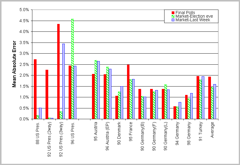
We see that the market outperformed the polls in 8 of the 15 cases. Across all elections, the average poll error was 1.93% while the average market error was 1.49% . Note that in the 1988 and 1992 U.S. presidential elections, the market dramatically outperformed the polls, while in the 1996 presidential election the polls did a lot better than the market.
Another such electronic market discussed in these articles is provided by TradeSports. Here we can also trade on markets with futures contracts. During the war you could bet on how long Hussain would stay in power. As this is written (May 6) you can bet on the whether weapons of mass destruction will be found in Iraq on or before May 31. This in a futures contract which pays $1 if such weapons are found on or before May 31 and $0 if they are not. The graph below gives the closing price for this conract from the time it was offered to May 5. The May 6th bid and asking prices are also provided.
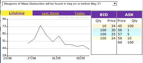
The closing price on May 5 was $39 providing an estimate of a 36% chance that such weapons will be found by May 31.
The New Yorker article also discussed the Hollywood Stock Exchange (HSX). Here you buy stock in movies with the value of the stock linked to its success in the box office. Even though this market uses play-money, the article states that the contract prices as a prediction of the success of a movie are being used by some movie companies because they often outperform the experts.
The HSX also allows you to buy options on the candidates for Oscars for eight categories. Again it is said that predictions based on the price of the options do better than the experts, in this case the movie critics. We looked at the last four years and compared the predictions of the HSX with the first five predictions we found in newspapers. Here is what we found (x indicates that the prediction was correct):
Awards 2000 |
Winner |
Hollywood
Stock Exchange |
San Diego Union-
Tribune |
San Francisco
Chronicle |
St. Petersburg
Times |
Denver Post |
Chicago Sun
Times |
| best picture |
American Beauty |
x |
x |
x |
x |
x |
x |
best actor |
Kevin Spacey |
x |
x |
x |
x |
x |
|
| best actress |
Hilary Swank |
x |
x |
||||
best supporting actor |
Michael Caine |
x |
x |
x |
x |
||
| best supporting
actress |
Angelina Jolie |
x |
x |
x |
x |
x |
x |
| best director |
Sam Mendes |
x |
x |
x |
x |
x |
x |
| best original
screen play |
American Beauty |
x |
x |
x |
x |
x |
|
| best adapted screen
play |
The Cider House Rules |
x |
x |
x |
x |
x |
|
Number correct |
8 |
6 |
7 |
7 |
6 |
5 |
Awards 2001 |
Winner |
Hollywood
Stock Exchange |
P:ittsburg
Post-Gazette |
San Francisco
Chronicle |
Times-Picayune
(New Orleans) |
The Irish Times |
Rocky Mountain
News |
| best picture |
Gladiator |
x |
x |
x |
x |
x |
|
best actor |
Russell Crowe |
x |
x |
x |
|||
best actress |
Julia Roberts |
x |
x |
x |
x |
x |
x |
best supporting actor |
Binicio Del Toro |
x |
x |
x |
x |
x |
|
best supporting actress |
Marcia Gay Harden |
||||||
best director |
Steven Soderbergh |
||||||
best original screen play |
Almost Famous |
x |
x |
||||
best adapted screen play |
Traffic |
x |
x |
x |
x |
x |
x |
number correct |
6 |
5 |
5 |
4 |
3 |
4 |
Awards 2002 |
Winner |
Hollywood
Stock Exchange |
Gazette (Montreal) |
San Francisco
Chronicle |
Chicago Sun
Times |
St. petersburg
Times) |
Rocky Mountain
News |
| best picture |
A Beautiful Mind |
x |
x |
x |
x |
x |
x |
best actor |
Denzel Washington |
x |
x |
x |
x |
||
best actress |
Halle Berry |
x |
x |
||||
best supporting actor |
Jim Broadbent |
||||||
| best supporting
actress |
Jennifer Connelly |
x |
x |
x |
x |
x |
|
| best director |
Ron Howard |
x |
x |
x |
x |
x |
x |
best original screen play |
Gosford Park |
x |
x |
x |
x |
||
best adapted screen play |
A Beautiful Mind |
x |
x |
x |
x |
||
Number correct |
5 |
4 |
6 |
4 |
6 |
6 |
Awards 2003 |
Winner |
Hollywood Stock
Exchange |
San Francisco
Chronicle |
St Petersburg
Times |
New York Daily
News |
The Times (London) |
Rocky Mountain
News |
| best picture |
Chicago |
x |
x |
x |
x |
x |
x |
best actor |
Andrien Brody |
||||||
best actress |
Nicole Kidman |
x |
x |
x |
x |
x |
|
best supporting actor |
Chris Cooper |
x |
x |
x |
x |
||
best supporting actress |
Catherine Zeta-Jones |
x |
x |
x |
x |
x |
|
best director |
Roman Polanski |
||||||
best original screen play |
Talk to her |
x |
|||||
best adapted screen play |
The Pianist |
||||||
number correct |
4 |
4 |
3 |
3 |
3 |
4 |
We see that the Hollywood Stock Exchange got as many correct as any of the critics in three out of the four years, while in the 2002 Oscar contest three critics beat them by one point. So we can certainly conclude that this electronic market is as good a predictor as the experts, but they do not appear to be significantly better than the critics.
In their article "Extracting collective probabilistic forecasts from web games" (1) Pennock and his colleagues analyze how well this and other electronic markets have done. The main objective of the Hollywood Stock Exchange is to predict box office returns of a movie. Obviously, this is important information for movie companies in planning which movies to push, and evidently they take the HSX market predictions seriously. Here is one of their graphs showing how well the HSX market predictions for four-week total returns of current movies agreed with what actually happened:
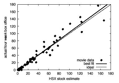
The dashed line corresponds to ideal accuracy; the solid line is the best linear fit.
The problem of comparing predictions from different sources is an interesting statistical problem not often discussed in standard statistical courses. We discussed this in the context of comparing different weather forecasters in Chance News 8.09 where we recommended Harold Brooks' co urse on weather forecasting. The article by Pennock and his colleagues provides another good source for studying how to test if one method of prediction is better than another.
Science writer Robert Matthews has a good popular account of electronic markets and of the work of Pennock and his colleagues in the New Scientist ( 3). This can also be found on Lexis Nexis by searching under journals.
DISCUSSION QUESTIONS:
(1) Note that by the Iowa market Hillary Clinton is more likely than any of the other three candidates to be nominated, but by Roxy's odds is less likely than any of these three to be the next president. Can you explain this?
(2) TradeSports also has a market relating to Bush being the next president. This market suggests that Bush has a 66% chance of being president. A similar market on the Iowa electronic market estimates this probability to be about 61%. The latest Gallup/CNN (February 24-26) asked:
If George W. Bush runs for re-election in 2004, in general are you more likely to vote for Bush or for the Democratic party's candidate for president?
47% of the registered voters said they would vote for Bush and 39% said they would vote for the democratic candidate. Can you explain these differences? Which do you think provides the best estimate?
(3) Pollsters say that these markets are not to be trusted because they are not a representative sample and do not provide a margin of error. Do you agree?
References:
(1) David M. Pennock, Finn Årup Nielsen, C. Lee Giles."
Extracting Collective Probabilistic Forecasts from Web Games".
Proceedings of the Seventh ACM SIGKDD International Conference on Knowledge
Discovery and Data Mining (KDD-2001), pp. 174-183, ACM, New York, 2001
(2) JE Berg, R Forsythe, FD Nelson and TA Rietz, 2001,
Results from a Dozen Years of Election Futures Markets Research,
forthcoming in CA Plott and V Smith (Eds) Handbook of Experimental Economic
Resuts.
(3) Robert Matthews, "Ask the oracle, " New Scientist, March 23, 2002.
Lone shares mirror mood swings of market.
Wall Street Journal, 31 March, 2003. C1
Ken Brown
This article is based on the a graph with the following description:
When global political or market events frighten investors, they tend to see the stock market as one big entity where individual stocks move up or down together. Below, the average six-month correlation between the performance of the average individual S&P-500 stocks and the index itself over the past 13 years is plotted. The higher the percentage of correlation, the more individual stocks move in unison with the overall market.
We wondered how many readers would understand how the graph was made. Then we realized that we ourselves did not understand it. We consulted Credit Suisse First Boston and learned that the data for the graph was prepared by Mika Toikka. Toikka told us that the article got it wrong. In particular, the index itself was not involved in making the graph. He explained that the graph was constructed as follows:
For a given day, for each pair of the 500 stocks in the S&P-500, the correlation between the pair's last six months daily returns (percentage increases or decreases) was computed. The average of these correlations over all possible pairs for the given day was calculated. These averages then were plotted for the thirteen-year period.
When the averages are high the returns of the individual stocks are highly correlated, so they would tend to follow the S&P index. The point of the graph is to show that this appears to occur at times of wars and other crises, suggesting that, at these times, buyers and sellers are not looking at the "fundamentals" of the stocks but rather are just following the market.
Referring to the period during the Iraq war, Toikka is quoted as saying:
It's been a difficult environment to pick up outperformance by picking stocks. Everything has been moving together so i'ts difficult to pick out home runs.
DISCUSSION QUESTIONS:
(1) Does this say that the market is not an "efficient" market during a war, and so we should be able to make money trading during a war?
(2) How do you think stock experts "pick out the home runs"?
Speaking of stocks, we neglected to report that the famous Wall Street Journal contest between the darts and the experts ended with the six-month period from March 14, 2002 to August 30, 2002. The contest had 147 six-month periods. The score of the experts vs darts was 90 to 57 in favor of the experts. For the experts vs the Dow Industrials the score was 80 to 67 in their favor.
If the winners were the result of tossing a coin 147 times, the expected number of wins for the experts would would be 73.5 with standard deviation 6.06. Thus the experts' 90 wins against the darts, was 16.5 greater than expected by chance. This is a deviation of more than two standard deviations but less than 3, making the results significant at the 95% level. But the experts' 80 wins against the Dow Industrials was only 6.5 more than expected by chance, which is about one standard deviation and hence not significant.
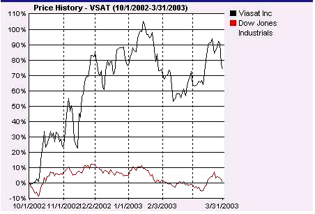
The dart contest still goes on but without the experts. Now it is the darts against the readers. The Journal compares the six month performance of six randomly chosen readers' stocks with six stocks chosen by throwing darts. In addition to this contest, the reader whose stock does the best gets a Wall Street Journal tote bag.
The winner of the tote bag for the six-month period ending March 31 was Paul Nelson who chose ViaSat Inc. to win. This is a digital satellite communication company whose clients include the U.S. military. Its stock rose 80% over this six-month period. Here is a comparison of the progress of this stock over this six-month period compared to the performance of the Dow.
The August 2002 meeting of the American Statistical Association had an interesting pair of talks on how graphics are done at the New York Times. The speakers were Charles Blow, the Graphics Director, and Arohie Tse, the Graphics Editor at the Times. The Times graphics are prepared by a group of about 30 people, mostly quite young and from a wide variety of backgrounds (none are statisticians) who work together trying out ideas on each other. They also consult statisticians and other researchers. They typically have at most three days to get the data and to make the graphic. Blow wrote in his abstract:
Information graphics designers in print journalism are presented with a wide variety of data types and formats, which often can't be captured by any standard visualization technique. They need to respond with eye-catching graphics that communicate information clearly and without distortion to a diverse readership--and they need to be ready before the story becomes stale.
Tse gave examples of graphics projects that he was responsible for, including the many graphics that accompanied the analysis of the Times's account of the Florida presidential ballots and the graphics associated with the release of the 2000 Census data. He compared graphs before and after color was introduced in the Times to show that much more information could now be included in graphics by using color. He said this was particularly true when reporting results of surveys, political polls and weather data.
While examples of Times graphics have won high praise from the experts including Tufte, they do not always avoid the well- known graphics pitfalls. Howard Wainer illustrated this by several examples of recent graphics from the Times when he introduced the speakers. In his wonderful Chance Lecture "How to display data badly" Wainer remarked that he only picked on the big guys, so most of his examples of bad graphics were taken from major newspapers.
Here is another interesting source of graphics in the media.
The Atlantic Monthly has a regular feature called "The Nation in Numbers" or when appropriate, "The World in Numbers". It consists of a two-page, color graphics display, along with data that is often organized around a map of the United States (or the world). There is also a brief companion text and some related tables or graphs. Here is a brief description of the topics and displays from the past few months.
April - Abortion Decisions: How the advent of prenatal
testing has complicated the moral calculus of abortion worldwide
A world map indicates by country both abortion legal status and its annual
rates per 1000 women aged 15--44 years, and there is a brief discussion
of whether and how these variables might be connected. One table displays
the percentages for select countries, of people and geneticists who would
abort in the first trimester for certain conditions; another gives the
percentage for select countries of geneticists who would test prenatally
or provide a referral for a couple with four girls who would abort another
girl.
March - Mortal Justice: the demography of the death
penalty,
A map of the U.S. displays state-by-state information about the death
penalty, such as execution rate, states with a moratorium on the death
penalty, and the number of death-row inmates exonerated; nationwide totals
are also provided.
One graph examines some counties in Texas where the execution rate is
especially high; another compares execution and murder rates by the race
of the offender and victim. The companion text notes that the race of
the victim appears to effect the execution rate more than the race of
the offender.
January/February - Does money buy happiness?
A scatter plot of smiling, neutral, or sad faces, labeled by country,
is shown where the horizontal axis represents income per person and the
vertical represents average life satisfaction. A companion graph displays
materialism and happiness indices for Americans; another charts money
versus love as predictors of happiness.
Tom Allaway sent us a note about a linguistic curiosity he discovered from the Brown Corpus. In linguistics"Corpus" means a collection of words. The Brown Corpus consists of about 1,000,000 words obtained by samples of size about 2000 taken from a collection of 500 texts. These 500 texts were chosen from 15 different categories of English texts published in the US in 1961 including newspaper articles, government reports, different categories of books etc.
Tom found at the virtual language centre a list of the 2000 most frequent words in the Brown Corpus and noted that the ranking of the words for the integers from 1 to 9 increased, i.e. the frequency of occurrence decreased. Here is what he found:
word |
rank |
freq |
rank x freq |
| one |
32 |
3297 |
105,504 |
two |
69 |
1412 |
97,428 |
three |
151 |
610 |
92,110 |
four |
260 |
359 |
93,340 |
five |
318 |
286 |
90,948 |
six |
420 |
220 |
92,400 |
seven |
903 |
114 |
102,942 |
eight |
1002 |
104 |
104,208 |
nine |
1302 |
81 |
105,462 |
The third column, which we included, illustrates Zipf's law which states
that the product of the rank and the frequencies of words in a text should
be approximately the same for all words. The existence of these large
data sets of words has led to new research related to Zipf's law, and
we will discuss some of this research in the next Chance news. However,
Zipf's law is not relevant to Tom's observation that the frequencies for
words representing single digit numbers are monotonically decreasing.
Tom's observation is similar to Benford's law which states that in many different sets of numbers, the frequencies of the leading digits of numbers decreases logarithmically. Since it would seem that most of these words would correspond to the leading digit of a number, it is natural to compare this with the Benford distribution.
To do this we looked at two other data sets of words. The first was the British National Corpus described as follows:
The British National Corpus (BNC) is a 100 million word collection of samples of written and spoken language from a wide range of sources, designed to represent a wide cross-section of current British English, both spoken and written.
The data providing the frequencies of the words is available from Adam Kilgarriff's website . For our second we searched on google for the words one, two, three etc and recorded the number of web pages that turned up. Of course these were huge numbers and related to the number of websites rather than distinct texts.
Since the word "one" has two different meanings we considered only the words for numbers from 2 to 9. We normalized the frequencies so that their sum adds to 1. Here are the results:
| Word | Brown | BNC | Benford | |
| two | .44 | .39 | .38 | .25 |
| three | .19 | .20 | .20 | .18 |
| four | .11 | .11 | .13 | .14 |
| five | .09 | .10 | .10 | .11 |
| six | .07 | .08 | .08 | .10 |
| seven | .04 | .04 | .05 | .08 |
| eight | .03 | .04 | .04 | .07 |
| nine | .03 | .03 | .03 | .07 |
We see that the desriptions for the different word data sets are quite simila,r but they are not consistent with the frequencies that would be predicted by the Benford distribution.
(1) Can you suggest an explanation for Tom's observation?
Copyright (c) 2003 Laurie Snell
This work is freely redistributable under the terms of the GNU General Public License published by the Free Software Foundation. This work comes with ABSOLUTELY NO WARRANTY.