Prepared by J. Laurie Snell, Bill Peterson, Jeanne Albert, and Charles Grinstead, with help from Fuxing Hou and Joan Snell.
We are now using a listserv to send out Chance News. You can sign on or off or change your address at this Chance listserv. This listserv is used only for mailing and not for comments on Chance News. We do appreciate comments and suggestions for new articles. Please send these to:
jlsnell@dartmouth.edu
The current and previous issues of Chance News and other materials for teaching a Chance course are available from the Chance web site.
Chance News is distributed under the GNU General Public License (so-called
'copyleft'). See the end of the newsletter for details.
Never mind the truth -- pursue probability through thick and thin in every kind of speech; the whole secret of the art of speaking lies in consistent adherence to this principle.
Plato, Phaedrus 272
Contents of Chance News 11.02
1. Forsooth.
2. Flipping, spinning and tilting coins.
3. Average career length of NFL players.
4. Teenage drinking a problem but not in way study found.
5. Spin on data blurs findings from Gallup's Muslim survey.
6. Competing risks and realities.
7. Safire on odds and probability.
8. Citation index: the counting house.
9. How cold? Even experts can't agree.
10. Marilyn on fairness of tossing a coin in making sports decisions.
11. The subjectivity of scientists and the Bayesian approach.
12. An amusing example of the gambler's paradox.
13. When we ran out of steam (three four star articles).
14. Laurie wins a bet with Peter.
Here are some Forsooth items from the March and April 2002 issues of RSS News.
The number of children who drowned in garden ponds has fallen, the Royal Society for the Prevention of Accidents reports. Eight children died in garden drowning accidents in 2000 compared with ten in 1999. The drop has been attributed to better safety awareness.
The Independent
23 January 2002
Play to win...
Our on-board scratchcards offer up to £88,000 in prizes
£1 card gives you a 1 in 4.5 chance of winning £5,000...
£2 card gives you a 1 in 2.6 chance of winning £10,000...
INFLight shopping magazine
Airtours International, Winter 2001 issue
France already has one of Europe's highest policing ratios -- 396 police and
gendarmes per inhabitant compared with 303 in the UK and 329 in Germany.
Financial Times
6 February 2002
Asian elephants are ten times as rare as African elephants.
The Times
29 January 2002
Editor's comment: It is estimated that there around 35,00 to 50,000 elephants in Asia as compared to about 500,000 in Africa.
Having seen what a great time statisticians have with real data in their statistics courses, we have often wondered why real data is not used more often in probability courses. Our colleague Peter Doyle has been doing this in his class when he discusses Chance News items. Our first two items are based on Peter's class discussions.
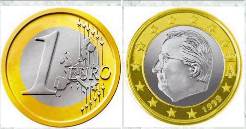
In Chance News 11.01 we reported that the Times (London), January 4, 2002 suggested that the new European one euro coins have a bias for heads when tossed or spun. We read in the Times article:
Two Polish mathematicians, Tomasz Gliszczynski and Waclaw Zawadowski,
set their university statistics classes to research the subject with the Belgian
one euro coin. Out of 250 spins, 140 showed the head of the Belgian monarch, King
Albert, while 110 showed the one euro symbol.
The test was carried out by spinning the coins on a table rather than tossing them in the air. An unscientific but mind-numbingly thorough test in the Times office showed a similar bias for the German one euro coin, both spinning it on the desk and tossing it in the air. The eagle came out on top 60 times out of 100 mid-air tosses and 54 times when spun on a flat surface. Euro coins have one side which is common
Here is what the one euro Belgian coins look like:
Your can hear Gliszczynski and Zawadowski discussion their experiment on NPR here.
There are three kinds of coin experiments that are often carried out in an introductory statistics course using U.S. pennies. Following terminology of Robin Lock we shall call them flips, tips and spins. For a "flip experiment" you toss coins in the air so that they flip over a number of times and you either catch them or let them fall on a surface where they will not bounce, For a "tip experiment" you stand a number of coins on their edge on a table and strike the table gently until all the coins have fallen over. For a "spin experiment" you spin coins on a table counting only those that comes to rest on the table without having hit any other object. . Conventional wisdom is that a flip experiment should not result in significantly more heads or tails than could be accounted for by chance. A tilt experiment should result in significantly more tails than heads and a spin experiment significantly more tails than could be accounted for by chance.
As we remarked in Chance News 10.03 there have historically been some large flip experiments. Here are the results of three such experiments.
|
Number of trials
|
Number of heads
|
Proportion of heads
|
Standard deviations from mean for fair
coin
|
95% Confidence interval for proportion
of heads
|
|
| Buffon |
4,040
|
2,048
|
.5070
|
.881
|
(.491, .522)
|
| Pearson |
24,000
|
12,012
|
.5005
|
.155
|
(.494, .507)
|
| Kerrich |
10,000
|
5,067
|
.5067
|
1.34
|
(.477, .517)
|
These experiments suggest that tossing a coin does not result in a bias for heads or tails.
Peter decided that the class should try the spin experiment for U.S. pennies. He got 2,000 pennies from our local bank and had the twenty students divide up in pairs and each pair spin 200 pennies. The result was 953 heads or 47.65% heads. If the probability for heads was p = 1/2 then the expected number of heads would be 1000 and the standard deviation would be 22.36. Then 953 heads would be 2.1 standard deviations below the expected number so we can reject the hypothesis that p = 1/2 at the 95% level.
Peter had heard from Princeton mathematician John Conway (famous geometer and inventor of "the game of life") that he had a great deal of experience with both the spin and the tilt experiments. In fact Conway would tell students that he could empower them to get more heads or more tails whichever they wanted. He would ask them which they wanted, warning them that they would have to live the rest of their life with the empowerment he gave them. If they choose heads he would have them carry out the tilt experiment resulting in about 85% heads and if they choose tails he would have do the spin experiment getting around 40% heads.
Disappointed by the class's 47.7% heads for his spin experiment, Peter wrote Conway who responded:
My guess is that you didn't pay much attention to the surface you spun 'em on - it makes a LOT of difference. In my own investigation-- the celebrated Burger King Study--50 pennies were spun 20 times over, and I got almost exactly 2:1 tails:heads. I didn't keep the records of the individual runs of 50, but remember that they got slowly better, showing that you can learn to spin them better.
When I take people into the kitchen, I make the ones who choose tails have a practice run first. In that, I tell them to "make it look like a little ball", and suggest that they (but never me) should remove any that don't. My guess is that you two, being lazy sods, just got a lot of students to spin so many each, with neither practice nor other instruction. Since it takes quite some time to learn to spin the coins, their first half-dozen or so will have been junk. I haven't kept decent statistics, but guess that the average proportion of tails is a bit above .6.
Conway's guess had a grain of truth to it since the students had spun the coins on a tiled floor that was a bit gritty. Therefore, at our Emmy's beer seminar, we tried another 2000 spins on a smooth table, requiring the spins to reach a little ball and be unobstructed. Now we got 913 heads in 2000 spins or 45.65% heads. We can summarize the Dartmouth efforts to determine the probability that a penny spun will turn up heads by:
|
Number of spins
|
Number of heads
|
Proportion of heads
|
Standard deviations from mean for fair
coin
|
95% Confidence interval for proportion
of heads
|
|
|
Peter's class
|
2000
|
953
|
.4765
|
-2.10
|
(.454, .499)
|
|
Emmys
|
2000
|
913
|
.4565
|
-3.89
|
(.434, .479)
|
These are still significantly higher percentages of heads than Conway's 40% prediction. So we decided to look for more data to get a better idea what is going on by seeing if others have tried to settle this question.
The largest set of data we could find was provided by Robin
Lock who wrote:
I have my students do a lab on this each semester. They do 100 flips, around 70 spins and 50 tips each - so I've accumulated lots of data, but I'm never completely sure about the reliability of the data. They do the trials on their own outside of class so I can't monitor how carefully they follow the instructions (e.g. if you bang the table hard you lose some of the "tip")
You can read Robin's instructions to the students here.
Note, in particular, that when flipping the coins he asks the students to "toss
the penny into the air, letting it flip over and over, then catch it."
You can see Robin's data here.
The results so far are:
|
Type
|
Number of trials
|
Number of heads
|
Proportion of heads
|
Standard deviations from mean for fair
coin
|
95% Confidence interval for proportion
of heads
|
| Flips |
29,015
|
14,709
|
.507
|
2.37
|
(.501, .513)
|
| Spins |
20,422
|
9,197
|
.450
|
-14.19
|
(.443, .457)
|
| Tips |
14,611
|
10,087
|
.690
|
46.02
|
(.683, .698)
|
Looking at the results of Robin's students, we see that the results for spinning are consistent with our results rather than the 40% suggested by Conway's.
We learned a possible explanation for the 40% conjecture from Doug Andrews who also has a spinning coins activity that he assigns each year. Doug writes:
The year of the coins is critical; early 1960's pennies are least likely to spin up heads. In early versions of this activity I just told students to keep track of the minting year, and suggested only mildly that they try to get older pennies. From those semesters, students using pennies minted since 1990 got 657 heads in 1350 spins, or 48.7%. Lately I've insisted that they use 1960's pennies to highlight the effect. Using 1960's pennies, my students have 1878/5520 = 34.0% heads over the past four semesters.
You can obtain Doug's instructions for his activity here and his data here.
Well, what about the claims for the Belgian one euro coins? We found it very
difficult to find these coins in the U.S. We finally were able to order some
from a Chard Jewellery in England. We
spun these coins 2000 times and got the following results:
Type
Number of trials
Number of heads
Proportion of heads
Standard deviations from mean for fair
coin
95% Confidence interval for proportion
of heads
flip
1000
497
.497
-.190
(..465, .592)
spin
2,000
1087
.5435
3.89
(.522,.566)
tilt
1000
307
.307
-12.27
(.277, .335)
Thus it appears that the one euro coin is biased towards heads when these coins are spun and towards tails when they are flipped--just the opposite of U.S. pennies.
It is interesting to try to understand what causes these biases in the spin and tip experiments. Two popular explanations for the spin experiment are that the diameter of the head side is greater than the diameter of the tail side and that one side is heavier than the other. Our colleague Dick Williamson measured the diameters of the two sides of U.S. pennies and found that the heads side was about .001 inches greater than the tail side for 1960 pennies but not significantly different for 2000 coins. This certainly supports the first explanation for the spin experiments for U.S. pennies. Unfortunately, Dick also found that, for the Belgian one euro coins, the diameter of the head side was again about .001 inches greater than the tail side. But, as we have seen, the spin experiment for the one euro coins results in more heads than tails, so this explanation would not work for these coins. Tomasz Gliszczynski and Waclaw Zawadowski believe that the one euro coin bias is due to the fact that the head side is heavier than the tail side.
DISCUSSION QUESTIONS:
(1) What do you think causes the bias in the tip experiments? Do you think the same explanation can be applied to the spin experiments? If not what do you think causes the bias in these experiments?
(2) What further experiments or measurements would you propose to better understand
these coin biases? Do you think that you could determine if the center of mass
of a coin?
(3) If some students in Robin's classes were to make up data for the number of heads in a flip experiment do you think they would get more heads or more tails. Do you think this might account for the bias for heads suggested by Robin's flip experiments?
This article reports that an updated study by the N.F.L
Players Association showed that professional football players cannot expect
to have a long playing career. According to the article:
The players union studied team rosters from the 1987 to 1996
seasons, an average of 1,647 players a year, or about 16,000 players years.
The study showed the average career of an NFL player is 3.3 years. The shortest
careers were those of running backs (2.57 years), followed by wide receivers
(2.81) and cornerbacks 2.94).
While the study did not speculate on the reason for the short careers, NFL officials said that the short careers are due primarily to the large number of high-speed collisions players experience. Players who are hit the least, quarterback and punters/kickers had the longest life spans: 4.44 years and 4.87 years.
Peter asked his students:
(1) Would the union prefer the study to show long careers or
short careers?
(2) How could they estimate the average career length of a player?
Not surprisingly the students felt that a union would be in a better bargaining position for higher salaries if the average player's career were short. The students suggested the following two methods for estimating the average career length.
(a) The life table method: From the ten years of data, estimate the probability
that if a player in his kth season will also play in his k+1st season. Assume
the system is in equilibrium and then use the life-table method for obtaining
the expected career length.
(b) Average the career lengths of each player whose career ended during this 10 year-period.
It was decided that either method would work, but to show the possibility of bias Peter also asked the students to consider a third method.
(c) Look at the players in the NFL in 1970, determine their career lengths, and average these.
It was decided that methods (a) and b) would be reasonable but (c) is the "bus
paradox" and so would overestimate the length of a player's career.
Mr. Duberstein, NFLPA Research Director, was good enough to send us the data
for this study so we could see the method they used to determine the average
career length of an NFL football player.
The basic data for the NFLPA study was obtained from the N.F.L records for the seasons 1987 to 1996 and is provided in columns 2 and 3 of the following table. Before discussing how the NFLPA estimated the average career length, we shall show how Peter's class decided that the average career length should be estimated from the data provided.
|
year x
|
average number of players in a season who have been in
the NFL x years |
proportion of players in a season who have
been in the NFL x years |
probability that an NFL player will have a career length of at least x years g(x) = l(x)/l(1) |
probability that an NFL player will have a career length of exactly x years p(x) = g(x)-g(x+1) |
probability that a player who has been in the NFL for
x years will play in the next season |
|
1
|
308.8
|
.1875
|
1.0000
|
.1632
|
.8368
|
|
2
|
258.4
|
.1569
|
0.8368
|
.1645
|
.8034
|
|
3
|
207.6
|
.1260
|
0.6723
|
.0855
|
.8728
|
|
4
|
181.2
|
.1100
|
0.5868
|
.0978
|
.8333
|
|
5
|
151
|
.0917
|
0.4890
|
.0764
|
.8437
|
|
6
|
127.4
|
.0774
|
0.4126
|
.0693
|
.8320
|
|
7
|
106
|
.0644
|
0.3433
|
.0716
|
.7915
|
|
8
|
83.9
|
.0509
|
0.2717
|
.0447
|
.8355
|
|
9
|
70.1
|
.0426
|
0.2270
|
.0593
|
.7389
|
|
10
|
51.8
|
.0315
|
0.1677
|
.0466
|
.7220
|
|
11
|
37.4
|
.0227
|
0.1211
|
.0366
|
.6979
|
|
12
|
26.1
|
.0158
|
0.0845
|
.0347
|
.5900
|
|
13
|
15.4
|
.0094
|
0.0499
|
.0123
|
.7532
|
|
14
|
11.6
|
.0070
|
0.0376
|
.0210
|
.4397
|
|
15
|
5.1
|
.0031
|
0.0165
|
.0074
|
.5490
|
|
16
|
2.8
|
.0017
|
0.0091
|
.0039
|
.5714
|
|
17
|
1.6
|
.0010
|
0.0052
|
.0039
|
.2500
|
|
18
|
.4
|
.0002
|
0.0013
|
.0003
|
.7500
|
|
19
|
.3
|
.0002
|
0.0010
|
.0006
|
.3333
|
|
20
|
.1
|
.0001
|
0.0003
|
.0003
|
|
|
sum = 1647
|
sum = 1
|
sum = 5.33
|
sum = 1
|
We assume that the system is in equilibrium so distribution of time in the
league for players in a given year is the same for all years. Then column 4,
giving the probability that a player's career is at least x years, is determined
as follows. Consider the year 2001. Then, to have an average of 258.4 in their
second year in 2002, a fraction 258.4/308.8 = .8368 of the players in their
first year in 2001 must go on to the 2002 season. Similarly, in 2003 to have
an average of 207.6 of the players in their third season, a fraction 207.6/308.8
= .6723 of the players in their first year in 2001 must go on at least two more
season. We continue in the same way to determine the rest of the column 4.
If X is any integer valued random variable then E(X) = Sum(x, P(X >= x ).
Thus if X is the career length of an NFL player then
E(X) = sum(x, g(x)) = sum(x, l(x))/l(1)) = 1647/308.8 = 5.33.
Note that we could have computed the expected career length directly from column 2 as sum /number in the first year.
Column 5 of our table gives the distribution p(x) for X so we could also have obtained the expected career length as E(X ) = sum(x, xp(x))
The NFLPA study provides data similar to that given in columns 2 and 3 for each position. This allowed us to calculate, in the same way, the expected number of years in the career of a player in each possible position. For example from the NFLPA's data we find that the average number of running backs in a season is 167.2 of which 38.4 are in their first year. Thus the expected career length for a running backs is 167.2/38.4 = 4.35. Doing this for each position we obtain:
|
position
|
expected career length
|
| all positions |
5.33
|
|
running backs
|
4.35
|
|
wide receivers
|
4.54
|
|
defensive tackles
|
4.71
|
|
tight ends
|
4.98
|
|
cornerbacks
|
5.13
|
|
defensive ends
|
5.39
|
|
linebackers
|
5.50
|
|
safeties
|
5.88
|
|
offensive line
|
5.95
|
|
quarterbacks
|
6.96
|
|
punters/kickers
|
8.33
|
From this we see that, not surprisingly, the players in positions who are hit the hardest have the shortest careers.
Using the the 4th column we can plot the career length distribution as estimated from this data:
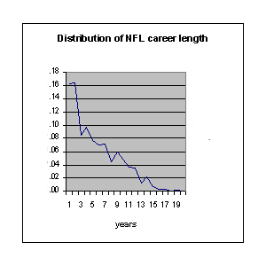
This suggests that the probability for a player who has lasted n seasons should last at least one more season is roughly independent of n. From column 6 we see that this is approximately true especially for the earlier years.
Well, that is the way that Peter and his students estimated a player's average career length of 5.33. However, recall that the New York Times article reported that the NFLPA found that the average career length for players in the NFL was 3.27. How did this happen?
To explain this it is convenient to have a name for the distribution given in column 3 for the length of time in the league for players in a given year. We will assume that the system is in equilibrium so this distribution is the same for all years and we will refer to it as the "equilibrium distribution." Note that it is not the same as the distribution of the career length of a player given in column 5.
If X is a discrete valued random variable with distribution p(x) then the median of X is a number m such that P(X >= m) >= 1/2 and P(X <= m) >= 1/2 (such a number always exists but need not be unique). If X is a player's career length, then from column 5 we see that P(X >= 4) = .586 and P(X <= 4) = .511 so the median career length of an NFL player is 4 seasons.
The NFLPA's estimate of 3.2 came from calculating the median of the equilibrium distribution rather than career length distribution. If Y is a random variable with the equilibrium distribution then from columns 3 we find that P(Y <= 4) = .580 and P(Y >= 4) = .530 so the median of X is 4. Rather than calculating the median this way the authors of the study noted that P(Y <= 3) = .470 and P(Y <= 4) = .580 and, since (.5 -.47)/(.58-.47) = .27, they interpolated to get a median of 3.27. Thus their answer was the result of calculating the median rather than the mean for the wrong distribution and even then not calculating it correctly.
While it happened that the median of the equilibrium distribution turned out to be the same as the median of the career length, this would not generally be true. Using column 4 we find that the mean of the equilibrium distribution is 4.56 which is quite different from the mean 5.33 for a player's career length.
We can model the process we have just described by a Markov chain. We illustrate this by a simplified situation corresponding to the OFL in the land of Oz. In the land of Oz there is only one position in football. A player can play at most 5 seasons. When he finishes a season he has a 90% chance probability of playing the next season. When a player leaves the OFL he is replaced by a new player in his first season. The state of the Markov chain is the number of years that the player in this position has been in the OFL. Here is the transition matrix P for this Markov Chance
|
state
|
1
|
2
|
3
|
4
|
5
|
|
|
1
|
.1
|
.9
|
0
|
0
|
0
|
|
|
P =
|
2
|
.1
|
0
|
.9
|
0
|
0
|
|
3
|
.1
|
0
|
0
|
.9
|
0
|
|
|
4
|
.1
|
0
|
0
|
0
|
.9
|
|
|
5
|
1
|
0
|
0
|
0
|
0
|
This is an ergodic Markov chain and we have a program that computes the basic descriptive quantities for such a chain. Running this program the following information:
| state |
1
|
2
|
3
|
4
|
5
|
| fixed vector |
.244
|
.220
|
.198
|
.178
|
.160
|
| state |
1
|
2
|
3
|
4
|
5
|
| mean recurrence time |
4.10
|
4.55
|
5.06
|
5.62
|
6.24
|
The fixed vector is the unique probability vector such that wP =w. It represents the probability of being in each of the states after the process has gone on long enough to reach equilibrium. The situation we have described above is like having 1647 such Markov chains running at once. Then the fixed vector tells us that in the land of Oz we would expect to find 24.4% of the players in their first season, 22% in their second, 19.8% in their third season, 17.8% in their 4th season and 16% in their 5th season. Thus it corresponds to what we called the equilibrium vector in our analysis of the NFL data. The mean recurrence times m(i) are the mean time for the chain started in state i to return to state i for the first time. For i = 1 we obtain mean career length for an OFL player. From Markov chain theory we know that m(i) = 1/w(i), which corresponds to our observation that in the NFL analysis the mean career length is the reciprocal of the proportion of players in their first year.
The distribution for the career length of a player in the land of Oz is easily calculated and is:
| state |
1
|
2
|
3
|
4
|
5
|
| distribution of length of career. |
.1
|
.09
|
.081
|
.0729
|
.6561
|
Note that the authors of the study would have computed the median of the equilibrium
distribution by noting that 46.4% of the players in a given year are in their
1st or 2nd season and 66.2% are in their first three years. Interpolating they
would get a median of 2.18 when they should be calculating the median of the
career length of a player which is 5 or the mean career length which is 4.10.
DISCUSSION QUESTIONS:
(1) Some might argue that when we say average we might be thinking of any of the quantities mean, mode, or median. Do you agree?
(2) Explain why Peter's suggestion (c) for estimating the expected career length would be biased.
(3) How do you think the student's suggestion (b) would compare with the life-table
method for estimating a player's expected career length?
Well, Peter's next class was devoted to explaining why he had lost a bet to Laurie. This hasn't reached any of the major newspapers yet so we have put this discussion at the end of this newsletter.
A recent study on underage drinking ("Teen Tipplers") conducted by Columbia University's National Center on Addiction and Substance Abuse (CASA) contained a simple error which was widely reported by news agencies. CASA uses data derived from the yearly Household Survey on Drug Abuse conducted by the Substance Abuse Mental Health Services Administration. The most recent survey from which information is available included 25,500 people, nearly 10,000 of whom were between the ages of 12 and 20, and underage drinkers accounted for about 25% of all drinking by people in the sample. This figure was reported in a press release by CASA's Chairman and President, Joseph A. Califano, Jr., ("Children under the age of 21 drink 25% of the alcohol consumed in the United States,") and was later widely reported in the news.
Although the 25% percent figure is correct for the sample, teenagers make up less than 20% of the U.S. population, rather than the nearly 40% of those surveyed. The corrected figure--confirmed by the government agency that collected the data--is 11.4%. In a subsequent press release, a CASA spokesperson stated that, "By an oversight, CASA did not make the adjustment for over sampling in the Household Survey. Nevertheless, CASA believes that the 11.4% is way too low for several reasons," including unreliability of self-reporting, and that data on "binge" drinkers and children under 12 did not contribute to the figures. Curiously, these concerns were not mentioned in the original press release.
You can read Califano's comments in the online news release for the study here. The full 145-page report is available in PDF format here.
DISCUSSION QUESTIONS:
(1) How is the corrected 11.4% figure obtained? Assuming that it is correct,
what percentage of the U.S. population is between the ages of 12 and 20?
(2) The article describes other findings of the CASA report. For example, while teenage "binge" drinking (five or more drinks at one time) has declined in the last decade, the gender gap has narrowed: in 1998, 6.6% of girls and 8.7% of boys reported binge drinking, compared to 11% and 19%, respectively, in 1988. What might account for this change?
(3) Does saying that 11.4% is "way too low" imply that 25% really isn't all that high?
Stuart Spivack suggested our next article.
The USA Today article reports on a Gallup poll conducted in December and January of 9,924 people in nine countries with large Muslim populations: Pakistan, Iran, Indonesia, Turkey, Lebanon, Morocco, Kuwait, Jordan, and Saudi Arabia. Some of the more alarming findings include: 53% of those surveyed had an unfavorable opinion of the U.S. In six of the nine countries less than 18% believed Arabs carried out the 9/11 attacks The article also includes a breakdown of the sample size by country and country-specific figures for answers to two questions:
Do Western societies show concern for the Islamic/Arabic Worlds?
Were the attacks on the World Trade Center and the Pentagon morally justifiable?
Nine percent thought the U.S. military action in Afghanistan was justified.
The Washington Post article reports on criticism this poll has received from the watchdog group The National Council on Public Polls. (Their March 6 response, Media Coverage of the Gallup Poll of The Islamic World", is available here). Citing the 53% and 18% figures above, the Post colorfully states:
One big problem: those numbers were the product of Enron-like arithmetic--sensational but meaningless amalgamations of results from nine separate surveys.
Other problems cited include the fact that fewer than half the world's Muslims live in the countries included in Gallup's survey, and that non-citizens--even non-Muslims--were included in the sample. Apparently the 53% figure that Gallup released to the press represented a simple (unweighted) average of the individual, country-specific percentages. Of course, the size of the Muslim populations in the nine countries varies considerably; for example, Kuwait has fewer than 2 million Muslims, while Indonesia has more than 200 million.
The initial faxes from Gallup that went out to USA Today and CNN included the averages along with the country-by-country results, but Andrea Stone (the author of the USA Today article) is quoted, "I didn't do the arithmetic."
DISCUSSION QUESTIONS:
(1). To explain the problem with simple averaging, the Post includes the following example.
36 percent of those interviewed in Kuwait said the Sept. 11 terrorist attacks were morally justifiable, compared to only 4 percent in Indonesia. If the results of the two countries were averaged, the result suggests that about 20 percent of these Muslims seemed to view the attack as justified. But that figure falls to about 5 percent if the results were properly adjusted to account for population.
What does "properly adjusted for population" mean? How did they get the 5% figure?
(2) The USA Today article lists margins of error for each of the nine countries. Given that non-citizens and non-Muslims were included in Gallup's survey, what is the meaning of these figures?
(3) What responsibility do you think reporters have to "do the arithmetic"?
Kaplan is a Professor of Management Sciences at Yale University. This is a reprint of an opinion piece he wrote for the "Jerusalem Post" (8 January 2002, p. 8), in which he comments on US State Department's warnings regarding travel to Israel. Kaplan argues that those warnings overstate the risk of traveling to Israel relative to other travel risks.
Kaplan reports that during the 442 days from the start of the latest Palestinian intifada until the end of 2001, only 120 Israelis were killed by terrorists within "Israel proper," which in his definition does not include the disputed West Bank and Gaza Strip. The population of Israel is 6.3 million, so this works out to a risk of 19 in one million. By contrast, Israel had 461 traffic fatalities in 2001, a risk of 73 in one million. Moreover, in the US, 145 persons in a million die each year in traffic accidents.
Kaplan says that he recently spent one week visiting "Israel proper." He estimates that his "combined probability of dying from either terrorism or a car crash on this visit equaled 1.7 in one million." He concludes that the most risky part of his trip was the drive from Yale to New York's Kennedy Airport.
DISCUSSION QUESTIONS:
(1) How did Kaplan calculate the 1.7 in one million risk for his trip?
(2) Do you find Kaplan's reasoning reassuring? To what extent is your perception
shaped by the escalation of violence between Israel and the Palestinians this
year?
Safire relates a number of instances where readers have written to correct statements he has made in his columns. Part of his discussion concerns the difference between odds and probabilities. He writes:
In a column last month I offered my "morning line" on the potential Democratic presidential candidates (Tom Daschle, 4 to 1; Joe Biden, 5 to 1; Al Gore, 2 to 1; and seven others at various odds).
"What Safire doesn't seem to realize," wrote Dan Seligman in Forbes magazine, "is that odds translate into percentage probabilities (e.g., 4-1 means the guy has a 20% chance) and that his probabilities add up to 168%. Alas, mutually exclusive contingencies cannot have probabilities adding up to more than 100%."
That's bad news for Gore, whose chances I have just dropped to 3 to 1, and for Joe Lieberman, now a 12 to 1 long shot. Scratch Biden.
In fact, Safire's column with presidential odds appeared last year (Odds-on favorites to run against Bush. The Atlanta Journal and Constitution, 26 June 2001, p. 11A). As we reported in Chance News 10.06, John Allen Paulos picked up the error and responded in his "Who's Counting" column, which you read online here.
In his article Dan Seligman observes that "liberal arts graduates control the media, which doubtless helps the prose--but generates endless screwups in numbers." In addition to Safire's trouble with odds, Seligman presented number of problematic examples from recent media reports. All might be labeled Forsooths. A recent Fortune article reported that some unfortunate stocks were selling at more than 100% below their conversion price. The Wall Street Journal reported that Ford's fourth quarter dividend was $270 billion, with writers and/or editors missing the fact that this must have been $270 million. Even Forbes itself was not exempt: it reported that Federal Express conveyors move packages at 540 feet per second (almost 370 mph!).
DISCUSSION QUESTIONS:
(1) Here are the odds against various candidates, as originally reported by Safire:
| Al Gore |
2 to 1
|
| Joe Lieberman |
5 to 1
|
| Tom Daschle |
4 to 1
|
| Dick Gephardt |
15 to 1
|
| Joe Biden |
5 to 1
|
| John Edwards |
9 to 1
|
| John Kerry |
4 to 1
|
| Pat Leahy |
6 to 1
|
| Chris Dodd |
4 to 1
|
| Russell Feingold |
8 to 1
|
Do you see why they imply probabilities adding to 1.68? Would changing Gore to 3 to 1 (and dealing similarly with the others) produce a reasonable probability distribution?
(2) Writing about the mammogram controversy, Ellen Goodman recently wrote:
"We've been told that picking up cancer on a mammogram before it's big
enough to feel improves the odds of survival by 30 percent. Of course, I can
do the math. Those same figures mean that mammograms make no difference in 70
percent of the cases." (Healthy doubts about mammograms, Boston Globe,
16 December 2001, p. D7). Seligman reproduces her statement in his Forbes article,
but says she botched the math. He writes: "It is quite consonant with a
30% overall survival gain that mammograms have some benefit in 100% of breast
cancer cases." How?
The ISI, formally known as the Institute for Scientific Information, was founded by Eugene Garfield in 1958. In 1992, it was acquired by Thomson Business Information. The company maintains a large database of references to research publications and provides a variety of search tools. The original goal was to facilitate literature searches by working scientists, which is certainly a worthy goal. However, the Nature article is concerned with potential misuses of the ISI's citation analyses. Government funding agencies and university promotions committees both face the problem of evaluating work that they may not have the time or expertise to read. It is very tempting to treat the frequency with which a work is cited as an objective measure of its quality. Here is an extreme example: Finland awards government funds to university hospitals on the basis of "publication points" derived from the ISI's "journal impact factors."
The ISI impact factor reflects the average number of citations that papers in a journal receive. As described on the company's web site, these calculations produce "quantifiable statistical data that provide a systematic, objective way to determine the relative importance of journals within their subject categories." Such data can obviously be helpful to a library that needs to decide what subscriptions to take. However, it is not clear that the contributions of individual authors can be meaningfully evaluated on the basis of the overall journal rankings. A graph accompanying the article shows that the top 15% of papers in a "typical" journal may account for half of the total citations. Moreover, journals like Nature include news summaries and correspondence which tend to get many citations over and above what the research articles alone would produce, thus overstating their impact.
Last year, ISI introduced a web-based product called "Essential Science Indicators." Purchasers can use this product to do their own searches of ISI's database, thereby obtaining direct counts of citations for individual authors. This sounds like an improvement over using journal impact factors. Unfortunately, the raw data are not as clean as nonexpert users might naively assume. For example, if one paper miscites or even misspells an author's name, that mistake can be replicated many times over as subsequent researchers copy the citation. Experts point out that the more frequently an article is cited, the greater the chance that such errors will be introduced. There are other complications as well. For example, Nature was surprised by the low citation rating for its special issue on the Human Genome. It turned out that citations to consortia (in this case the International Human Genome Sequencing Consortium), rather than traditional author lists, were being undercounted.
DISCUSSION QUESTION:
Suppose you could get perfectly accurate counts of how often various works
had been cited, and you used these counts to rank the significance of those
works. Can you think of any reasons that experts might still disagree with those
ranks?
Since 1973, the National Weather Service (NWS)has included statements about the wind chill in its winter forecasts. Exposed skin loses heat faster when the wind is blowing harder, and it was important provide public safety information, such as the risk of frostbite.
As described in the article, the original experiments to compute the wind chill factor were not very sophisticated, and involved hanging a bucket on a pole to see how fast it cooled. Also, forecasters used wind speeds measured on high towers, which did not necessarily correspond to experience on the ground. This past November, the NWS introduced a new index, based on an improved model for heat transfer. One member of the research team, Maurice Bluestein, is featured in an anecdote that leads off the Globe article. He was shoveling snow on a night when warnings had been issued for windchills of 65 degrees below zero, but he realized that he didn't feel very cold.
The NWS has a web page that presents a table of the windchill values and an indication of time to frostbite:
There is an online calculator here and also a graph comparing old and new indexes at an ambient temperature of 5 degrees F. The new index steady drop off steadily as the wind increases from 25 to 100 mph. The old index dropped off much more steeply, actually rising to match the new value at around 100 mph. Presumably, the sharp dropoff is what contributed to Bluestein's snow-shoveling experience.
But the question is not yet closed. There is a competing index, AccuWeather's "real-feel temperature," which that company introduced in 1999. AccuWeather says it gives a better indication of people's subjective experience of cold. However, even this index does not try to account for person-to-person variation.
DISCUSSION QUESTION:
When you tune in to your local weather forecast, are you interested in a scientifically
verified measure of heat transfer or in a subjective measure of how cold you
will feel?
A reader asks: "You often see situations such as two teams determining an issue with a coin toss, where one team gets to choose 'heads' or 'tails' first. Is this fair?"
Marilyn says it is. She goes on to say that it would still be fair with a two-headed or two-tailed coin, provided that the team who chooses has no information about the coin.
DISCUSSION QUESTION:
Is Marilyn right? How would you choose to guarantee yourself a 50-50 chance
of winning the toss, even though the coin itself might not be fair?
Critics of Bayesian statistics complain that it relies too heavily on subjectivity. The authors of this book set out to show that subjectivity is at the heart of almost all science. At its best, subjectivity leads scientists to important new discoveries. At its worst, it leads to fraudulent behavior such as fudging data to make the results fit scientists' theories of how the experiment should turn out.
In Chance News 7.09 we discussed a classic article by Gary Taubes, ("The (political) science of salt", Science, 14 August 1998, pp. 898-907.).This article provides a case study of a national health recommendation to eat less salt to lower your blood pressure. The original recommendation was based on "ecological" studies that showed that countries whose population had low salt diets had lower rates of hypertension. Unfortunately, studies within a given population did not show that those with low salt diets had lower blood pressure. In the past three decades there have been many more studies including controlled studies. However, Taubes reports that researchers took their position on this issue based on early studies and interpreted modern studies to fit their position. This has kept scientists divided and has led to what Taubes calls "one of the longest running, most vitriolic, and surreal disputes in all of medicine."
This heart of this book is Chapters 3, 4, and 5. In chapter 3 entitled "Some
well-known stories of extreme subjectivity", the authors discuss the work
of five well-known scientists, some of whose work involved subjective decisions
and manipulation of data to support prior believes.
The first scientist discussed in Chapter 3 is Joahnnes Kepler. Kepler stated that he had confirmed that the planets has elliptical orbits by independent observations. But evidence has been provided that Kepler determined the data from his theory itself rather than from the observations.
The second scientist is George Mendel. Here we read about the famous observation of R.A. Fisher that Mendel's famous pea data to support his theory on how genes are inherited were "too good to be true". In his discussion of this Fisher remarks:
Although no explanation can be expected to be satisfactory, it remains a possibility among others that Mendel was deceived by some assistant who knew too well what was expected.
If this were the case, we might say this is an example of too much loyalty rather than too much subjectivity. However, we would still be able to find plenty of subjectivity in this issue by comparing the defense of Mendel by his supporters and the defense of Fisher by his supporters. You can find references to these discussions at Roger Blumberg's MendelWeb.
The third example is Robert Millikan. Here we read about the experience of Gerald Holton studying Millikan's notebooks related to his famous oil droplets experiment to measure the charge e on a single electron. He found some variability in his estimate for e in difference sets of observations. Millikan gave a personal quality-of-measurment rating to each of the sets of observations in his original 1910 experiment. He then used these to obtain a weighted average of the values obtained from his sets of observation which gave him the estimate for e of 4.85*10^(-10) electrostatic units. The simple average would have given him 4.70*10^(-10) which would have been closer to the currently accepted value of 4.77*10^(-10). Holton also found that, referring to specific sets of observations, Milliken wrote: "publish this", "beauty", and "error high, will not use."
The authors, fourth example is the British psychologist Cyril Burt. Burt carried out a number of experiments based on Galton's suggestion that non-identical twins could be used to study the variation of hereditary characteristics within a family, and identical twins could be used to study the effects of environment. In a series of papers published between 1943 and 1946, Burt concluded that heredity plays a more prominent role in the development of intellectual ability than does the environment. Shortly after his death, his work was studied by Leon Kamin who found irregularities in the data which suggested that some of the data was fraudulent. For example, he observed that in two of Burt's studies of identical twins reared apart, tests of intelligence yielded the same correlation, .771, despite the fact that in one study there were 21 pairs of twins and in the other 53 pairs. Similarly, for two studies of identical twins raised together, he found the same correlation of .994 despite the fact that there were 85 pairs in one experiment and 95 pairs in the other study. Kamin's findings led to a further investigation of Burt's work which in turn led many to conclude that Burt had fabricated his IQ data. Again there are those who defend Burt's work and it would not be surprising to find that the two camps are pretty much determined by their aprior belief in the inheritability of intelligence.
The authors' fifth example is Margaret Mead. Margaret Mead was a world-famous American anthropologist who first book "Coming of Age in Samoa" became an anthropological classic by the time of her death. This book claimed to show that Samoa is a stress-free life for adolescents as compared to the highly stressed lives of adolescents in the United States. She attributes this to the freedom of Samoan adolescents to indulge in sexual experimentation without feelings of guilt, an upbringing that does not emphasize competitiveness, and residence in large extended families which minimizes emotional involvement between children and parents.
After her death, anthropologist Derek Freeman reviewed Mead's work and concluded that Mead reported what she wanted to see rather that what she actually saw. Another critic, Martin Orans, states that since Mead did not use a random sample means that one has to trust her judgment as to the way she chose the people to interview. He observes that Mead could have chosen a random sample of the adolescents from the villages she studied to remove the subjectivity of her choices.
In Chapter 4, which is over half the book, the authors look at the works of twelve scientists judged to be among the greatest scientists of our times to see if they can identify the role of subjectivity in their work. So as to not introduce their own subjectivity in choosing the scientists, they used the 12 scientists chosen by Jack Meadows in his book "The Great Scientists":
Aristotle
Galileo Galilei
William Harvey
Isaac Newton
Antoine Lavoisier
Alexander von Humboldt
Michael Faraday
Charles Darwin
Louis Pasteur
Sigmund Freud
Marie Curie
Albert Einstein
In this chapter we find a comprehensive discussion of each of the twelve scientists
lives and works. Each chapter has the following sections:
A. Brief biographical sketch
B. Scientific contributions
C. Major works
D. Subjectivity in their work.
References
Unlike Chapter 3 where the use of subjectivity discussed represented bad science, in this chapter the authors look at the way these scientists have used subjectivity both in good and bad ways. They had no trouble finding a liberal use of subjectivity in the the work of all of these scientists.
Reading this chapter you will gain a wonderful new understanding of the lives and the work of history's great scientists. Since the account ranges in time from Aristotle to Einstein one can see how the history of the scientific method has developed. This includes, for example, how the role of experiments has changed from the time it was introduced by Aristotle, the role of mathematics since it was so successfully exploited by Newton and the role of "thought experiments" since they were introduced by Galileo and refined by Einstein. When the entire work and methodology of the scientist is taken into account it does get harder to separate the use of subjectivity from the use of objectivity. But as the authors convincingly demonstrate, subjectivity is the one thing that is common to all of these scientist's works. They conclude this chapter with an interesting section called "Some conjectures about the scientists." Here the authors conjecture what the famous scientists might have done had Bayesian analysis been available to them.
In Chapter 5 the authors show how Bayesian methods allow researchers to formally introduce subjectivity, represented in the beliefs, information, or knowledge before the experiments, into the design of their experiments. Curiously, especially given the title of the book, this chapter is only 25 pages, less than ten percent of the book. This allows only very simple examples to be considered. Readers of Chance News would have especially appreciated seeing how it applies to medical trials and controversies such as the current mammogram controversy. The authors do provide an "Annotated guide to some literature on methods for Bayesian analysis in this chapter and an Appendix: "References by field of application for Bayesian statistical science" but these are no substitute for more substantial application in the book itself.
This is a fascinating book which is beautifully written and should have a wide readership. It can be understood by the general public and will go a long way to giving them a better understanding of the scientific method.
Readers of Chance News will enjoy reading this book and find it a wonderful resource for their teaching.
Former Dartmouth student David Hemmer ('96) sent us the following amusing suggestion.
This is the story of a young man with eye problems. Our interest is in the following segment of the article.
I'm in the doctor's waiting room, and they said that 1 in 20 will have some complications in surgery. Not something extremely complicated so you'll go blind, but enough to stop the surgery so you'd have to do it over. And I didn't want that.
We're waiting. And we're praying out loud that since it's 1 out of 20 with complications,
we're praying that the people in front of us get screwed up. Then my odds would
be better. It got me nervous, about the 1-in-20 thing.
The other folks in the waiting room were getting aggravated. They didn't appreciate
Shane's mathematics.
They overheard us, started freaking out, and they tell the nurse, "This guy is praying for complications for us! Tell him to stop it."
Here are three articles that our readers will enjoy that we planned to write about but ran out of steam. We may return to them in the next Chance News.
Emerging results from randomized studies are not showing the benefits from hormone replacement therapy that were predicted from previous observational studies. This article discusses the problems that arise when observational studies and randomized studies do not agree. Lots of quotations from leading epidemiologists.
This article discusses one of the major mammogram studies which statisticians Donald Berry and David Freedman agree has a flaw. These two statisticians disagree about the implications of this flaw for the outcomes of the study. Berry believes that it invalidates the conclusion of the study that mammograms were effective in preventing breast cancer and Freedman feels that corrections can be made in the analysis of the data which will justify the original conclusion.
This would be a great article for class discussion. Unfortunately is is not available from Lexis Nexis so you will have to get it from the New York Times or your library.
Stuart Spivack suggested the following interesting article that we missed:
Here is the first paragraph to give you an idea of what the article is about.
Players on the TV game show The Weakest Link should either take no chances at all or cast caution to the winds. A team does best if it banks its winnings either after every right answer or only after a run of six successive right answers.
Dear Jon
I decided to pay off the bet with Laurie. His side of the bet was that there
is distribution for the positive random variable S such that if you pick randomly
one of two envelopes, one containing S and one containing 2S, then no matter
what is in the first envelope, you're better off switching to the second envelope.
The example is S= 2^k with probability 1/3 * (2/3)^k, k=0,1,2,... In this case,
no matter what is in the first envelope,the conditional expectation of what
is in the second envelope is larger: If there is 1 in the first envelope, there
is certainly 2 in the second, and if there is 2^k (k>0) in the first envelope,
then with probability .6 there is 2^(k-1) in the second envelope, and with probability
.4 there is 2^(k+1), so the conditional expected value in the second envelope
is 1.1 * 2^k.
Of course if the conditional expected value in the second envelope is always larger, then the (unconditional) expected value in the second envelope is larger than the expected value in the first. By symmetry, the expected value in the first envelope is larger than the expected value in the second envelope, so by transitivity the expected value in the first envelope is larger than the expected value in the first envelope. The expected value in the first envelope is infinite!
But while it is true that the conditional expectation of what is in the second envelope is larger, THIS DOESN'T MEAN YOU SHOULD SWITCH! That's because expected value is not enough to determine what makes a good bet. In this example, by switching, you're taking a bet that will double your winnings with probability .4, and halve your winnings with probability .6. Whether this is advisable depends on the size of your entire fortune. You wouldn't want to put your entire fortune into a bet like this, even though the expected value is positive, because if you take chances like this consistently, you'll wind up way behind. For example, if you do something like this 1000 times, you'll wind up doubling your fortune roughly 400 times, and halving it 600 times, and that's not good. But if the amount in the first envelope is (say) $1 billion, then it is effectively your entire fortune, so in this case you should not switch. Just where the cutoff is for when you should switch depends on your fortune (a good exercise!), but no matter what your fortune, there is a cutoff beyond which you should not switch.
So, did Laurie really win this bet? As usual with a Snell bet, there is some question as to what the bet really was. If you were to simulate this game, you would see that if you always switch, you will fare no better or worse than if you never switch. This is obvious by symmetry. Nevertheless, I decided to pay up because a reasonable person could argue with a straight face that Laurie won.
Cheers,
Peter
Note: This example appears in the article:
Copyright (c) 2001 Laurie
Snell
This work is freely redistributable
under the terms of the GNU
General Public License published
by the Free Software Foundation.
This work comes with ABSOLUTELY NO
WARRANTY.