
SCI199Y: October 31, 1995
Where we go from here
The topics that I suggested last week were ranked in approximately this order:
For the next several weeks, I will organize readings around this list, with the most preferred topics given emphasis. Omitted from the ranking were two important, and I think interesting, topics: where to find data, and the news behind the news. I will try to make sure that these topics get covered as part of the discussion.
Each week, I'll assign reading for the following week. The reading will form the basis for class discussion, and the discussion will be lead by two students. I'll also bring one or two newspaper articles, to be read and discussed in class.
Required for next week
Further reading
I get most of the news articles from the Globe and Mail (as if you hadn't guessed), and from the WWW, on a page called Chance News. (The URL is http://www.geom.umn.edu/docs/snell/chance/chance-news.html). The bulk of the background articles come from the magazine Chance.
Some elementary statistics texts that could be helpful are
There are a few popular paperbacks that specifically address statistical issues in a non-technical way:
John Allen Paulos is a talented popularizer of mathematical and statistical ideas. Although he's a bit pompous at times, these books are easy to read and quite informative. His 1991 book Beyond Innumeracy gave me the idea for the technical notes that I put at the end of lecture notes.
The author argues that quite a bit of misinformation hides behind statistics, and a bit of education in the basic ideas of statistics and probability, would go a long way to exposing the perpetrators.
If you're interested in aspects of polling, there is a nice collection of articles in the book
What is the bell curve anyway(reprinted from last week)
One way to describe a measurement that varies in a population is to quote the frequency of each possible measurement in that population. (Think of the students lined up on the lawn of Penn. State, according to their height.) With many types of measurements, as you get a larger and larger population, with frequencies measured on a finer and finer grid, the plot of the frequencies will start to look like a curve of a very predictable form. (Think of getting 50 times as many students lined up by height classes, and taking a photo from an airplane. Then 5000 times as many students, seen from the space shuttle...)
The frequency curve has a particular mathematical expression, in standard form, as:
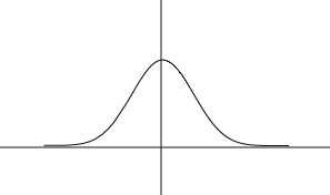
and has the familiar bell shape indicated in the accompanying figure.
It is a surprising, but true, fact that a wide variety of potential measurements tend to follow this curve, once the measurements are converted to standard units. It is a theorem, known as the central limit theorem, that the frequency distribution of measurements that are averages will always follow this curve, as the number of things being averaged increases. (With a bit of a stretch, you could imagine a particular person's height being determined by a number of effects that are averaged: genetic makeup, pre-natal nutrition, post-natal nutrition, etc.. IQ's are typically computed by averaging over a number of test items.)
The frequency curve given above has the property that about 2/3 of its mass is contained in the interval

and about 95% of it mass is contained in the interval

. In other words, 95% of the measurements, heights, IQ scores, whatever, will fall within 2 standard units of the center point. The center point is called the mean, and the standard unit is called the standard deviation.
In fact, my analogy above to looking at the students lined up by height, from space, doesn't quite work, unless we think of lining up either all females, or all males. Even from space we'd probably see two humps.
Even when measurements do have a frequency distribution that is exactly described by the bell curve, they can vary enough to look surprising. On p.172 of VDQI, Tufte shows 12 sets of 50 measurements from the bell curve. What is plotted is the actual frequency distribution for each set of 50 measurements.
This document was generated using the LaTeX2HTML translator Version 0.6.4 (Tues Aug 30 1994) Copyright © 1993, 1994, Nikos Drakos, Computer Based Learning Unit, University of Leeds.
The command line arguments were:
latex2html -split 0 lec7.tex.
The translation was initiated by Marie K. Snell on Thu Nov 16 14:58:26 CST 1995