SCI199Y: October 24, 1995
Required for next week
More on the polls
The following table is taken from the Globe & Mail, Wednesday, October 18
and Saturday, October 21. It seems to be the definitive summary of the polls,
to date, although it's not 100% consistent with earlier published
stories.![]()
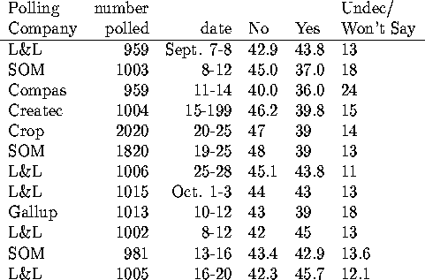
The numbers that make the headlines have the undecideds allocated to either yes or no. There was an excellent discussion of this in the G& on October 18 (A5). SOM allocates the undecideds in the percentages observed in the decided voters; approximately 50-50. Leger & Leger allocates them based on their answers to other questions in the poll and on demographic factors; about 70% to no. This results in a substantial boost to the reported No vote. The poll corresponding to the last line in the above table was reported as a headline: ``Yes 50.2, No 49.8, poll suggests". (The poll of size 2020 has a margin of error of approximately 2.2%; the poll of size 1820 has a margin of error of approximately 2.3%. The other polls have a margin of error of 3.1%)
In other news this week...
What is the bell curve anyway
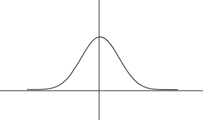
One way to describe a measurement that varies in a population is to quote the frequency of each possible measurement in that population. (Think of the students lined up on the lawn of Penn. State, according to their height.) With many types of measurements, as you get a larger and larger population, with frequencies measured on a finer and finer grid, the plot of the frequencies will start to look like a curve of a very predictable form. (Think of getting 5 times as many students lined up by height classes, and taking a photo from an airplane. Then 500 times as many students, seen from the space shuttle...)
The frequency curve has a particular mathematical expression, in standard form, as:
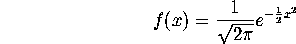
and looks like this:
It is a surprising, but true, fact that a wide variety of potential measurements tend to follow this curve, once the measurements are converted to standard units. It is a theorem, known as the central limit theorem, that the frequency distribution of measurements that are averages will always follow this curve, as the number of things being averaged increases. (With a bit of a stretch, you could imagine a particular person's height being determined by a number of effects that are averaged: genetic makeup, pre-natal nutrition, post-natal nutrition, etc.. IQ's are typically computed by averaging over a number of test items.)
The frequency curve given above has the property that about 2/3 of its mass is contained in the interval

and about 95% of it mass is contained in the interval

. In other words, 95% of the measurements, heights, IQ scores, whatever, will fall within 2 standard units of the center point. The center point is called the mean, and the standard unit is called the standard deviation.
In fact, my analogy above to looking at the students lined up by height, from space, doesn't quite work, unless we think of lining up either all females, or all males. Even from space we'd probably see two humps.
Even when measurements do have a frequency distribution that is exactly described by the bell curve, they can vary enough to look surprising. On p.172 of VDQI, Tufte shows 12 sets of 50 measurements from the bell curve. What is plotted is the actual frequency distribution for each set of 50 measurements.
This document was generated using the LaTeX2HTML translator Version 0.6.4 (Tues Aug 30 1994) Copyright © 1993, 1994, Nikos Drakos, Computer Based Learning Unit, University of Leeds.
The command line arguments were:
latex2html -split 0 lec6.tex.
The translation was initiated by Marie K. Snell on Thu Nov 16 15:35:47 CST 1995