Prepared by J. Laurie Snell, Bill Peterson, Jeanne Albert, and Charles Grinstead, with help from Fuxing Hou and Joan Snell. We are now using a listserv to send out notices that a new Chance News has been posted on the Chance Website. You can sign on or off or change your address at this Chance listserv. This listserv is used only for this posting and not for comments on Chance News. We do appreciate comments and suggestions for new articles. Please send these to jlsnell@dartmouth.edu. Chance News is based on current news articles referenced in Chance News Lite.
The current and previous issues of Chance News and other materials for teaching a Chance course are available from the Chance web site.
Chance News is distributed under the GNU General Public License (so-called
'copyleft'). See the end of the newsletter for details.
Contents of Chance News 12.06
(1) Charles Murphy ranks the greats.
(2) Myles McLeod on estimating the number affected by the power
outage.
(3) Myels McLeod gives a better answer to Marylin's question.
(4) Headache specialists get more headaches.
(5) Are the apparent successes in Texas schools real?
(6) Power point makes you dumb.
(7) ESP:will mainstream science remains unconvinced?
(8) Futures markets.
(9) Young success means early death.
(10) Betting on lives of teachers.
(11) Myles McLeod on Stanford's federal financial aid.
(12) Who is this fellow Myles McLeod?
I know of scarcely anything so apt to impress the imagination as the wonderful form of cosmic order expressed by the "Law of Frequency of Error." (Central Limit Theorem) The law would have been personified by the Greeks and deified, if they had known of it. It reigns with serenity and in complete self-effacement, amidst the wildest confusion. The huger the mob, and the greater the apparent anarchy, the more perfect is its sway. It is the supreme law of Unreason. Whenever a large sample of chaotic elements are taken in hand and marshaled in the order of their magnitude, an unsuspected and most beautiful form of regularity proves to have been latent all along.
Francis Galtons
Our first topic was suggested by Dan Rockmore.
Human Accomplishment: The pursuit of excellence
in the arts and sciences, 800 B.C. to 1950.
Charles Murray, Harper Collins , 688 pages, October 2003, $29.95 (Hardcover)
The book jacket reminds us that Charles Murray was Co-author of The Bell Curve and, while Human Accomplishment will undoubtedly be controversial, it is is unlikely to match The Bell Curve in this regard.
In this book, Murray ranks the greats in almost every field of human endeavor covering the time period from -800 BC to 1950. For each field Murray identifies a a number of sources providing information about the leading figures in the field. The rankings are made from information in these sources. We illustrate how this is done using mathematics. The sources for mathematics consisted of 28 books all written since 1960. Of these, 21 were from general science books including A History of the Sciences by S.F. Mason, The Biographical Dictionary of Scientists by Porter and Ogilvie and The Timetables of Science by Hellemand and Bunch. The remaining 7 books deal specifically with mathematics and included Mathematical Thought from Ancient to Modern Times by Felix Kline, A History of Mathematics by Boyer and Merzbach, and The Universe of the Mind by Owen.
Murray identifies all the mathematicians mentioned in these sources, in all 906. The number of sources is then cut down to 16 by requiring that a source include a broad coverage of mathematics and a significant number of the 906 mathematicians identified from the larger set of sources. Next the number of mathematicians is cut down t0 109 by requiring that, to be included, a mathematician must occur in at least half the sources.
Then a score is determined for each of the 191 mathematicians based on how much attentionis accorded them in the 16 math sources. How attention is measured depends on the nature of the source. Consider a particular mathematician, say Gauss. For a standard history, it is measured by the number of unique pages in the index related to the Gauss. For a chronology of events it would be the total number of events discussed that involve him. For biographical dictionaries the measure consists of the number of columns devoted to him.
Then using these measures of attention, a raw score is attached to each mathematician in a way that takes into account that the sources cover difference periods of times, have different length etc. Then these raw scores are normalized so that the lowest score is 1 and the highest score is 100. The resulting scores are called "Index Scores".
Here are the top twenty mathematicians, philosophers, physicists, and musical composers ranked by their index score.
|
|
|
|
Murray expects that there will be general agreement on the first 3 or 4 but less so on the lower ranks. I'm sure we can all find our favorites missing from the list. Despite Murray's heavy use of statistics, he did not include statistics as a field in his analysis, so R.A. Fisher had to settle for a score of 3 under Biology. Murray would probably argue that statistics is too recent a field, but there are certainly lots of great statisticians who made major contributions before 1950.
We cannot begin to discuss all the issues involved in Murray's ranking the greats. Murray anticipates a concern about biases in his methodology and the second half of his book is pretty much an attempt to allay these fears. We will discuss one of the statistical aspects of his study that interested us, but for the non-statistical issues you could start with following reviews. But, as was the case for the "Bell Curve", this is no substitute for reading the book.
The United Press Association conducted an interview with Murray about his book. Here is a sample question and answer:
Q. Can you truly quantify objectively which artists and
scientists were the most eminent?
A. Sure. It's one of the most well-developed quantitative measures in the social
sciences. (The measurement of intelligence is one of its few competitors, incidentally.)
My indices have a statistical reliability that is phenomenal for the social
sciences. There's also a very high "face validity" -- in other words,
the rankings broadly correspond to common-sense expectations.
A review in the Tech Law Journal discusses the book in relation to public policy. The author suggests a number of studies that could have been carried out with Murray's data but were not. He also is critical of the manipulation he feels that Murray did to conclude that the rate of innovation is on the decline since the 19th century.
A review for the Wall Street Journal, written by Gary Rosen, has the following commentary on Murray's use of statistics in his book.
Mr. Murray's number-crunching apparatus is impressive in its way and makes it possible for him to generate some illuminating graphs and "scatter plots" showing the geographic and historical distribution of humankind's achievements. But it also brings to mind, inevitably, the japing definition of social science as "the elaborate demonstration of the obvious by methods that are obscure." Much as I share Mr. Murray's respect for expert opinion--as well as his eagerness to counter the ignorance-mongering of the academic avant-garde--I doubt that his findings will appear any more objective because he has chosen to count the words of the cognoscenti rather than to read them.
Of course this is as much a commentary on Rosen as it is on Murray.
A review for the New York Times by Judith Schulevitz discusses possible biases in rating the greats by the amount of attention paid to them in encyclopedias and other such sources. Like other reviewers Schulevitz notes that most of Murray's greats are Dead White European Males. Schulevitz has the mistaken idea that all evaluations were made by counting lines in encylopedias.No encyclopedias were used in math though they were occasionally used in other fields.
Finally the Cato Institute provides a video of a lecture Murray gave discussing his book and some of the response to it.
Now we return to statistics. The first person to apply statistics in a discussion of the greats appears to be Francis Galton in his classic book Hereditary Genius (1869) [1] . Like Murray, Galton believed that having a high reputation is a marker for being very gifted. He writes:
I feel convinced that no man can achieve a very high reputation without being gifted with very high abilities; and I trust I have shown reason to believe, that few who possess these very high abilities can fail in achieving eminence.
Unlike Murray, Galton was not particularly interested in ranking the greats but rather wanted to show that genius or greatness is inherited. He did this by showing that famous people have more famous relatives than could be explained by chance. Presumably, this was part of his eugenics efforts. Galton had a field day when he got to music and discovered that, in the biographical collections of musicians he was using, there were 57 Bachs.
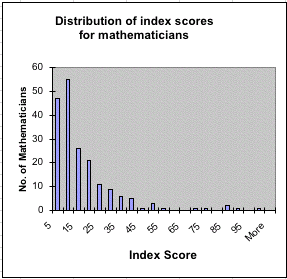
Returning to Murray's analysis, here is a bar chart of the frequency of the index scores for mathematicians.
This is a very skewed distribution-- too skewed to be the tail of a normal distribution. Murray tells us that distributions for the frequency of his index scores are similar to distributions studied by Afred Lotka in his paper The frequency distribution of scientific productivity [2]. Lotka was chemist, demographer, ecologist and mathematician best known for his predator-prey model proposed at the same time independently by Volterra. His scientific productivity paper was written in 1926 while working for the Metropolitan Life Insurance Company. It begins with the remark:
It would be of interest to determine, if possible, the part which men of different caliber contribute to the progress of science.
To pursue this, Lokta counted the number of times a particular chemist was mentioned in the decennial index of Chemical Abstracts 1907-1916. A similar process for physicists was applied to the name index in a history of physics by F. Auerbach. Referring to the Auerbach example, Lotka says:
We obtain a measure not merely of volume of productivity, but account is taken, in some degree, also of the quality, since only the outstanding contributions find a place in this little volume, with its 110 pages of tabular text.
Lotka includes the data from both books in his article, but we consider only the Auerbach example.
Lotka's Auerbach data.
|
|
Let h(k) be the proportion of the physicists in the book who are mentioned k times. Then h(k) is the probability that a randomly chosen physicist from the list of 1325 will be mentioned k times in Auerbach's book. If we think of h(k) as an empirical distribution it makes sense to ask what kind of theoretical distribution best fits this data.
Lotka suggested that this empirical distribution can best be fit by a distribution of the form:
f(k) = c/ka (1)
for k = 1,2,3,... and c and a are constants. This distribution has become called a " Lotka distribution" and is also called a "power law". Lotka estimated a should be about 2 for his Auerbach data. Then he showed that c is determined by summing (1) over all k, giving
1 = c/ (1 + 1/22 + 1/32 + . . . + 1/k2 + . . .) = c/( p2/6).
Thus c = 6/p2 = .6079. Since c = y(1), this means that our theoretical distribution would predict that about 61% of the physicists would be mentioned only once. From the empirical distribution, we see that 59% were mentioned only once.
Anyone reading one of the recent books on the Riemann Hypothesis would realize that Lokta's method for determining c from a works for any a if we use Riemann's zeta function:
zeta(s) = 1 + 1/2s + 1/3s + . . . + 1/ks + . . .
Using this, we see that, for any a > 1, c = 1/zeta(a). Recall that zeta(1) is infinite and zeta(2) = p2/6.
Our readers will recall that the Lotka distribution also appeared in our discussion of Zip's law (See Chance News 12.03). Here, we were interested in the distribution of the number of times that a given word occurs in a text. Zip's law says that this should be approximated by a Lotka distribution with a about 1.
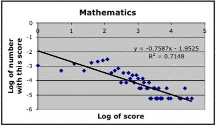
If we take the the log of both sides of (1) we obtain log(f(k)) = -alog(k) + log(c) giving a linear relationship between log(k) and log(f(k)). Thus we can use linear regression to determine f(k) as a Lotka distribution with a given by the slope of the line that best fits the empirical distribution. Here is the scatter plot using the Auerbach data:
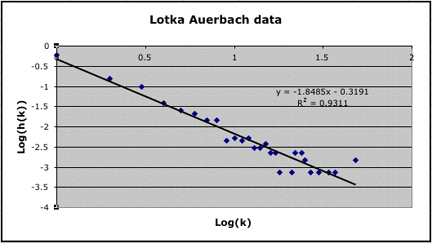
We see that a Lotka distribution with a = 1.85 fits our empirical distribution quite well with R2 = .93. We have c = 1/zeta(1.85) = .551. Thus this theoretical distribution would predict that about 55% of the physicists would be mentioned once as compared to the 59% from the empirical distribution. Lotka did a similar linear regression to estimate a, but he used only the first 17 items in his data, remarking that there was too much fluctuation beyond this. By truncating the distribution Lotka got a power law distribution with a = 2 and c = .61.
The question of the best way to fit a Lotka distribution to an empirical distribution has been discussed by Brendan and Ronald Rousseau [3]. The authors remark that the regression method only gives satisfactory results when the data is truncated as Lotka did. They say:
Nicholls [4] has convincingly shown that the maximum likelihood estimator is by far the best way to estimate a.
The Rousseaus also provide a program to carry out this maximum likelihood estimate. Using their program and not truncating Lotka's data we obtained an estimate of 2.05 for a with a resulting estimate c = .626 which is more in line with Lotka's results obtained by truncating the data.
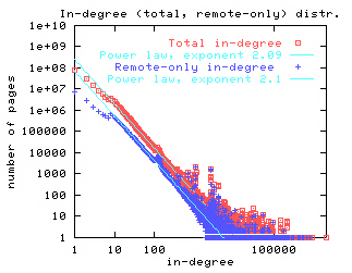
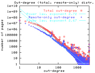
The power law distribution has been found to apply to a wide variety of fields. Most recently it is has been shown to apply to links to the statistics of the world wide web. For example, Broder et al [5] have shown that the probability of a randomly chosen web page has k web pages linked to it (in-degree is k) can be estimated by a Lotka distribution with a = 2.09. Similarly, they showed that the probability that a randomly chosen web page has links to k other web sites (out-degree is k) can be estimated by a Lotka distribution with a = 2.71. They provide the following graphs to illustrate this.
 |
 |
Similar results were obtained by Albert, Jeong and Barabasi [6].
Whenever empirical data fits a particular distribution in a variety of situations, it is natural to ask for a probability model that might help explain why this distribution occurs so often. For example, the Bernoulli trials model explains why we should expect the normal distribution in a wide variety of situations.
Herbert Simon [7] provided a very simple probability model to explain the occurrence of power law distributions. Gilbert [8] uses simulation to test this model, using as an example, the frequency distribution for the number of times an author appears in a particular journal. Here is how Simon's process works for this example.
We start with the journal having one article. Then for each successive article is with probability a by an author who has not yet published in the journal and with probability 1-a is by an author chosen at random from those who have published articles in the journal. Then Simon shows that the frequency distribution for the number of times an author contributes to a journal is asymptotically a Lotka distribution with parameter a.
Bornholdt and Ebel [9] apply Simon's model to obtain the power law distributions for the world wide web similar to those obtained by Border et al.
How does all this work for for Murray's data? Here are the scatter plots using the index scores for mathematicians and the Western musicians.
 |
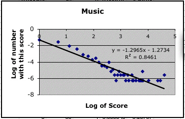 |
These are not as convincing as Lotka's data, but they are consistent with the idea that Lotka's distribution is appropriate for Murray's data.
Murray raises an interesting question. It would seem that eminence in science for example is the result of abilities such as I.Q. that typically have a normal distribution. Why then isn't a measure of overall excellence normally distributed? Murray gives the following interesting sports example to show that this need not be the case.
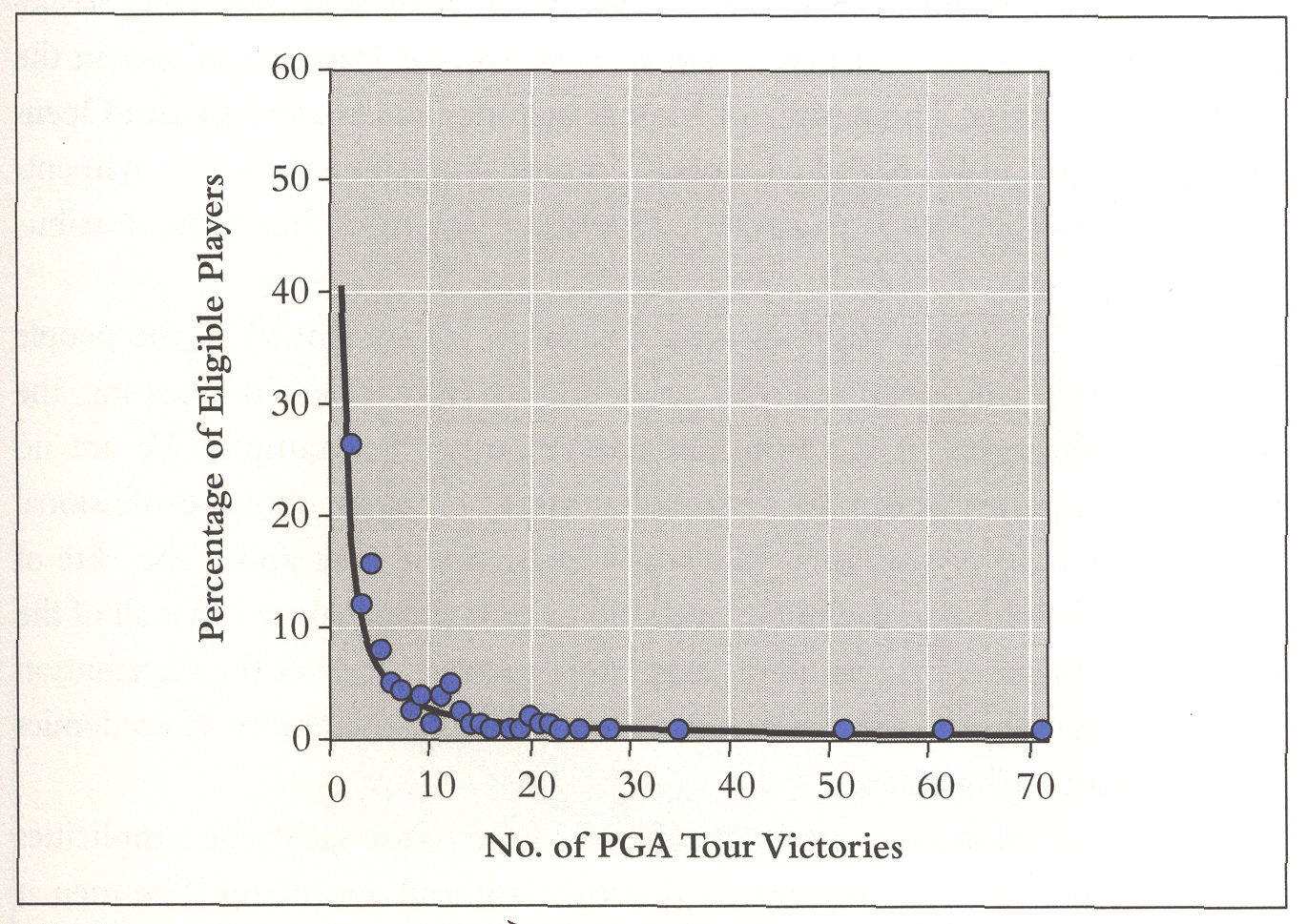
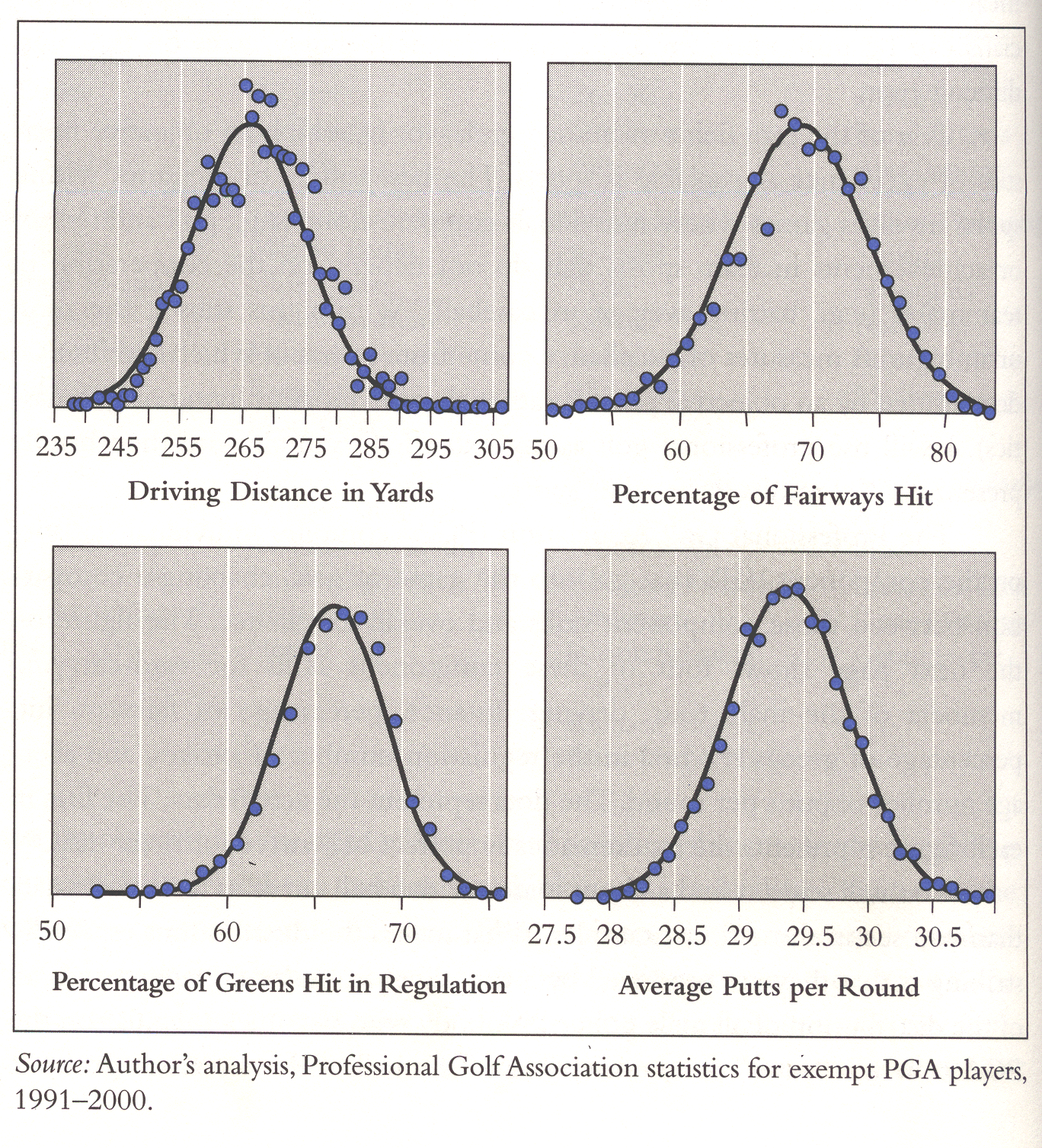
Murray looked at a group of to top golfers. More specifically, he chose golfers who were under the age of 45 as of 1970, had made the cut (survived to the last two rounds) of the men's PGA Championship at least once from 1970 to 1989, who had retired or passed the age of 45 by the end of the 2001 season, and had won at least one tournament in the course of their careers. He then shows that these golfers had a Lotka type distribution for the percentage of PGA Tour victories, but their skills at driving distant, fairway hits, green hits and puts were better described by normal distributions. Murray shows this with the following graphs:
Murray mentioned that William Shockly[7] has an explanation for how normal distributions could be combined to obtain skewed distributions. Shockly looked at the number of papers scientists publish and noted a skewed distribution which he believed to be a log-normal distribution. He then argues that the ability to write papers requires several different special abilities, ability to recognize a good problem, to write well, etc. and you only write successful papers if you have them all. In the golf example, to win, the golfer must have all four abilities. Thus a random variable representing a player's skill would be the product of four random variables and the log of the golfer's skill would be the sum of the log of the individual abilities and hence approximately normally distributed leading to a log-normal distribution.
REFERENCES
[1] Francis Galton, Hereditary Genius, New York: D. Appleton & Co. 1870, second edition 1892 available here.
[2] A. J. Lotka. The frequency distribution of scientific productivity, J. of the Washington Acad. of Sci. 16, 317-323, 1926.
[3] Brendan Rousseau and Ronald Rousseau, LOTKA: A program to fit a power law distribution to observed frequency data. Cybermetrics, Volume 4 (2000) Issue 1, paper 4.
[4] Nicholls, P.T. (1988),"Estimation of Zipf parameters", Journal of the American Society of Information Science, 38 (1987), 443-445. + Erratum, JASIS, 39 (1988), p. 287.
[5] A. Broder et. al. Graph structure in the web: experiments and models, in Proc. of the 9th Intl. WWW Conf., 2000.
[6] R. Albert, H. Jeong and A. Barabasi, Diameter of the World Wide Web, Nature, 401, September 9, 1999.
[7] Herbert A. Simon. Models of Man, New York, NY: John Wiley and Sons, 1957
[8] N. Gilbert. (1997), A Simulation of the Structure of Academic Science, Sociological Research Online, vol. 2, no. 2.
[9] S. Bornholdt, H. Ebel, World wide web scaling exponent from Simon's 1955 model.
DISCUSSION QUESTIONS:
(1) Murray admits that other explanations have been given for a high rating when excellence is measured by number of publications, attention received etc. Can you gives such explanations?
(2) Grades on exams often result in a normal distributions. On the other hand Galton provided data on the famed Cambridge mathematics Tripos which showed that this is not the case for these exams. He obtained data from a particular grader for two years of tests and looked at the top 200 scores. A scatter plot suggests that the frequency of the scores can be approximated by a Lotka distribution. You can see the data and a scatter plot here. These scores go up to 7,000 so they must have some way to weight the individual problems. See if you can find out how this is done and see if this could account for the skewed distribution.
In Chance News 12.05 we discussed an article in the New York Times reporting that the media estimate that 50 million people were effected by the August 14th 2002 Northeast blackout was too large. This was the result of a misinterpretation of a news release of the reliability council, which sets rules for managing the electrical grid. This release said:
Approximately 61,800 megawatts of customer load was lost in an area that covers 50 million people; we cannot say with precision how many customers were affected at this time.
The 50 million estimate was clearly too large since not all people in the area covered were without power. For example, it is said that in the New York area about 20% of the available power remained on.
As a discussion question we asked:
How might the council estimate the number of people without power?
We received the following elegant answer from Myles McLeod.
Chance News 12.05. Comments for item (6) How many in the dark? Evidently
not 50 Million.
Myles McLeod
U.S. Air Force satellite images of the Northeast U.S.
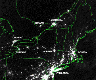
Satellite
image of Northeast US and Canada taken Aug 13 the night before the blackout.
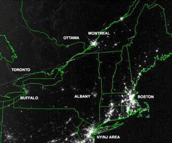
Satellite image taken Aug 14 during blackout showing cities affected by the power outage.
Which U.S. states were affected most by the blackout?
The satellite images show that New York, Pennsylvania,
and New Jersey were affected most by the power outage, though not completely.
States east of New York are served by a different power grid, hence those
states were generally unaffected. In fact, the Boston area appears brighter
on Aug 14 than it did on the previous night. Perhaps the number of Boston
area late night cable news television viewers had increased.
How many people live in New York, Pennsylvania,
and New Jersey?
Using 2002 census population estimates by state, a ballpark figure for these three states can be computed.
| New Jersey | 8,590,300 |
| New York | 19,157,532 |
| Pennsylvania | 12,335,091 |
Approximately 40,082,923 live in these three states.
How many households does 40,082,923 persons represent?
Census data says that the mean number of persons per household for New Jersey, New York, Pennsylvania are 2.68, 2.61, and 2.48 persons. Across all U.S. households, there are 2.59 persons per household. Coincidentally, the average of the three states of interest also equals 2.59.
Household size distribution data from a source such as New York State 2000 Demographics can be used to demonstrate how person- per-thousehold statistics are calculated:
|
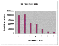 |
To check, New York State's 2000 population should equal (7,056,860 * 2.5849) = 18,241,616. 18 million is about right.
Finally, how many persons does 10.5 million customers (households) represent?
persons = households * persons/household
= 10,500,000 * 2.59Conclusion.
= 27,195,000
The widely quoted 50,000,000 person estimate very likely overestimated the persons without power by at least 23,000,000!
An alternate method.View the satellite images again. Estimate the drop in light intensity for the three states over the two- day period. 50-60% seems reasonable.
Light intensity drop * population = people without power.
.50 *40,082,923 = 20,041,462
.60*40,082,923 = 24,049,754
Using this method we get 20 - 24 million, which is fairly close to the first method. Most of us do not have access to satellite photography. However, a news person could certainly get such pictures from a weather department on short notice.
Myles also provided the answer for our discussion question for the next item which appeared in the current Chance News Lite.
Ask Marilyn.
Parade Magazine, 30 November, 2003, p. 8
Marilyn Vos Savant
A reader writes:
Considering the great volume of correspondence you receive, what is the probability that any one person's question will appear in your column? Pam Nuwer, Blasdell, N.Y.
Marilyn replies:
Probability isn't involved. I don't stand blindfolded on a stage while wearing a sequined outfit and draw letters from a rotating drum. If you send a question that suits the column (and that hasn't been answered before) your chances of seeing it published are excellent.
DISCUSSION QUESTION
Could Marilyn have used statistics to give a more informative answer?
Here is Myles' answer:
Let M = Avg Number of letters received in any given month.
Let T = Cumulative number of letters previously answered in Marilyn's column.
Let O = Avg Number of letters sent in any given month that contain previously
asked questions.
Let U = Avg Number of letters sent in any given month that ask unsuitable questions.
Let NS = Number of letters sent in any given month that contain new and suitable
questions.
The probability that any one question in a given month is new and suitable:
P(NS) = ((M-O-U)/T)(N/(M-O-U)) = (N/T)
Here is a plot of the relationship:
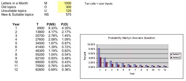
T = Cumulative letters previously answered. Each is question in T is unique.
NS = New & Suitable topics = M - O - U
P(NS) = ((M-O-U)/T)(N/(M-O-U)) = (N/T)
This shows that the probability Marilyn will answer a reader's question falls dramatically for any combination of M, O, and U. The model would be more realistic if the inputs were randomized. However, doing so would not affect the outcome much. Variable T's influence predominates. Intuitively, that makes sense -Marilyn answers only a small fixed number of the many letters she receives each month while the large cumulative total that is always used in the calculation grows.
A more accurate, less interesting answer would have been:
"Poor; below 1%."
Marilyn's editor might not approve.
Charles Grinstead thought this article was pretty funny.
Vital signs: patterns; A big professional headache.
New York Times, 2 Dec. 2003, F6
Eric Nagourney
This article reports that headache specialists get more headaches than others do.
Evidence of this is to be found in a report in the current issue of Neurology: "The prevalence of migraine in neurologists", Randolph W. Eveans and others, 2003;61:1271-12720. The study is based on a survey of 220 neurologists who attended medical education courses on headaches at nine different locations and a similar survey at a neurology conference that was not devoted to headaches. The New York Times article states:
Eighteen percent of women and 6 percent of men in the general
population say they have at least one migraine in a given year. Among women
practicing neurology, the figure was 58 percent, and among the men, 34 percent.
The difference was even more pronounced for headache specialists. Seventy-four
percent of the women reported having migraines, as did 59 percent of the men.
The incidence of migraines over the course of their lives, not just in one year,
was even higher.
DISCUSSION QUESTION:
What explanations do you think the authors suggested for this unpleasant discovery?
A
miracle revisited:
Measuring success; Gains in Houston schools: How real are they?
New York Times, 3 Dec. 2003, A1
Diana Jean Schemo and Ford Fessenden
The article starts with relating the sad experience of Rosa Arevelo who, despite the fact that a high school program of college prep courses earned her the designation "Texas scholar", had a bad experience in college described in the article as:
At the University of Houston, though, Ms. Arevelo discovered the distance between what Texas public schools called success and what she needed to know. Trained to write five-paragraph "persuasive essays" for the state exam, she was stumped by her first writing assignment. She failed the college entrance exam in math twice, even with a year of remedial algebra. At 19, she gave up and went to trade school.
The authors go on to say:
In recent years, Texas has trumpeted the academic gains of Ms.
Arevelo and millions more students largely on the basis of a state test, the
Texas Assessment of Academic Skills, or TAAS. As a presidential candidate, Texas's
former governor, George W. Bush, contended that Texas's methods of holding schools
responsible for student performance had brought huge improvements in passing
rates and remarkable strides in eliminating the gap between white and minority
children.
The claims catapulted Houston's superintendent, Rod Paige, to
Washington as education secretary and made Texas a model for the country. The
education law signed by President Bush in January 2002, No Child Left Behind,
gives public schools 12 years to match Houston's success and bring virtually
all children to academic proficiency.
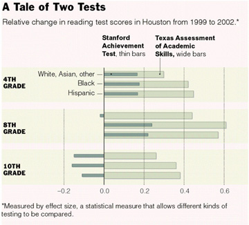
The article discusses a study that NYTimes carried out to see how well Texas students were doing on national tests compared to other states. They invited education experts to asses their study, and they seemed to agree with the assessment of Daniel Koretz of the Harvard School of Education who reviewed the Times analysis and remarked: This says that the progress on TAAS is probably overstated, possibly by quite a margin. And when all is said and done Houston looks average or below average.
The authors provide the following graphics showing the results of their study.
 |
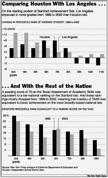 |
The article provides the following statistical remarks on how the Houston test scores were analyzed:
The calculations for this article were based on the records
of 75,000 Houston students in Grades 3 through 8 and Grade 10 who took the Texas
Assessment of Academic Skills as well as the Stanford Achievement Test in 1999
and 2002. The New York Times calculated the change in the mean scores
in math and reading for those two years for each grade and divided by the standard
deviation for 1999, a recognized method for calculating the effectiveness of
new teaching methods known as effect size. The method allows different kinds
of tests to be compared.
The national rankings that were equivalent to the passing score of 70 on the
Texas exam were calculated with a regression equation, a statistical measure
that uses all student scores to predict the result on one test from the scores
on the other.
DISCUSSION QUESTION:
Do you think that the Times method of statistical analysis was reasonable?
Every December the New York Times Magazine sends its reporters to find" bright notions, bold inventions, genius schemes and mad dreams that took off (or tried to)" in the past year. They reported in a report called "The Year of Ideas." Peter Kostelec suggested that we look at the statistics contributions in this report. We discuss four that we found in the report.
PowerPoint
makes you dumb.
New York Times Magazine, 14 December, 2003
By Cliff Thompson
This year saw the blossoming of PowerPoint but also brought a claim by Edward Tufte, in his new book The Cognitive Style of PowerPoint, that it forces people to mutilate data beyond comprehension. Thompson begins with the following example:
In August, the Columbia Accident Investigation Board at NASA
released Volume 1 of its report on why the space shuttle crashed. As expected,
the ship's foam insulation was the main cause of the disaster. But the board
also fingered another unusual culprit: PowerPoint, Microsoft's well-known ''slideware''
program.
NASA, the board argued, had become too reliant on presenting complex information
via PowerPoint, instead of by means of traditional ink-and-paper technical reports.
When NASA engineers assessed possible wing damage during the mission, they presented
the findings in a confusing PowerPoint slide -- so crammed with nested bullet
points and irregular short forms that it was nearly impossible to untangle.
''It is easy to understand how a senior manager might read this PowerPoint slide
and not realize that it addresses a life-threatening situation,'' the board
sternly noted.
Thompson reports that Miscrosoft begs to differ with Tufte's evaluation of their product. Here is one of our favorite examples from the book: slide 4 of a PowerPoint presentation of the Gettysburg Address prepared by Peter Norvig who said that it was easy to do with the help of Microsoft Powerpoint Autocontent Wizard.
You can view all the slides here.
DISCUSSION QUESTION:
Do you agree with Tufte than power point presentations are so bad? If so, why do so many people use them?
This article starts by reminding us that half of Americans believe in some kind of "anomalous phenomena" such as clairvoyance, prayer healing, ESP etc. It goes on to say that, up to now, mainstream science remains unconvinced but then go on to say:
This may be about to change. This year, Elizabeth Lloyd Mayer, a professor of psychology at the University of California Berkeley, introduced a conceptual model to explain seeming inexplicable event scientifically.
All attempts to find the conceptual model on the internet failed, so we may have to wait until the book comes out. Professor Mayer has written a book Extraordinary knowing:making sense of the inexplicable in everyday life to be published by Bantam in 2004. You can read more about this book here.
The NYTimes article says that Mayer's research led her to Robert G. Jahn at Princeton. For the last 25 years Jahn, former head of the Engineering Department, has directed the Princeton Engineering Anomalies Research (PEAR) laboratory to do ESP experiments. Subjects are asked to attempt to influence the path of a random walk. An experiment has three stages. In one, the subject is asked to try to make the random walk go up, in another to make it go down and in a third to stay close to the origin. Over the years Jahn has accumulated a ton of data which, when analyzed, appears to show that the subjects are able to make more heads turn up or more tails than could be accounted for by chance. However, the effect is small and unpredictable so it has not led to a way to make money at a casino. We taught the Chance Course at Princeton and the students found this lab fascinating. You can read a nice description of the PEAR lab here as reported in another New York Times article. Here is a graphic which appears on the PEAR website.
Cumulative deviation graphs from a random-event generator experiment.
The three curves, showing the cumlative results of the three stages of the experiments, show the apparent success of the experiments.
Originally Jahn thought that the subjects influenced the random generator by conscious mental processes but, as explained in a 2001 paper, a reanalysis of the data suggested that the influence is through unconscious processes. Mayer also believes this as described in the announcement of her forthcoming book:
Mayer's thesis is that we are all capable of experiencing a connectedness verging on an ultimate unity with other people, as well as with every other aspect of our material reality. That radical connectedness occurs as a transaction which takes place between the realm of unconscious mental processing – as understood by contemporary neuroscience and cognitive science – and the realm of intangible physical dynamics – as identified by contemporary physics in concepts like implicate order, string theory, EPR-entanglement, and quantum wholeness.
Two related websites that you might like to look at are Global Consciousness Project(GCP) and the Boundary Institute. The Global Consciousness Project has 50 random-number generators, scattered over the world, reporting their random bits to the GCP. The GCP hypothesizes that major world events will have an effect on these generators. They have analyzed many such events, predicted and non-predicted, over the past 5 years. The Boundary Institute also studies anomalous phenomena. A particularly interesting study, showing the effect of the 9-11 disaster on the GCP random-number generators, was published in the Foundation of Physics Letters, and can be found here . These sites would be useful for student projects, since all the data and their analyses, using interesting statistical tests, are available from these sites.
DISCUSSION QUESTION:
Do you think Mayer's book will change mainstream scientist's skepticism?
Futures
markets in everything.
New York Times Magazine, 14 December, 2003
By Noam Scheiber
Readers of Chance News are familiar with the notion of futures markets (see Chance News 12.02). Scheiber discusses markets we have discussed, such as the Iowa Electronic Markets, the Hollywood Stock Exchange and the ill-fated Pentagon Policy Analyses Market. Regarding the latter market Scheiber asks: What C.I.A. analyst with knowledge of Iraq would have bet money that we'd discover an advanced nuclear program after the war? Scheiber also discuss one that was new to us.
In 1997, Hewlett-Packard set up a similar market to help the company predict monthly sales figures. The participants were midlevel sales managers who, in the normal course of things, might have shaded their estimates on the high side to please their superiors (sound familiar, George Tenet?). The advantage of the company's futures market was that it was anonymous, meaning no one could be punished for hazarding an honest opinion. Factor in the profit motive, and it's no surprise that honesty is exactly what the market elicited. About 75 percent of the market's forecasts over the next three years proved better predictors of actual sales than the company's official forecasts.
Young
success means early death.
New York Times Magazine, 14 December, 2003
Dan Pink
This article describes research by Stewart McCann published in the February issue of Personality and Social Psychology Bulletin. Pink describes this research as:
McCann's research concerns what he calls the ''precocity-longevity hypothesis.'' McCann analyzed the lives of 1,672 U.S. governors who served between 1789 and 1978 and found that those who were elected at relatively tender ages generally died earlier than their less precocious counterparts. Even when he controlled for the year that the governors were born, how long they served and what state they governed, the pattern held. No matter how he sliced the data, ran the regressions or accounted for various statistical biases, the story remained the same: governors elected to office at younger ages tended to have shorter lives.
Unlike the study showing that Oscar winners live longer than non-winners discussed in Chance News 12.02, McCann wants to show that young governors live on average less long than older governors. One explanation for this could be that the fact that the life expectancy of a 40- yea- old is longer than that of a person who is 20. As Dartmouth student Mark Mixer put it: People who have had knee operations live longer than those who have not had knee operations. McCann avoids this obvious bias by looking separately at appropriate sub-samples of governors in which all in a sub-sample reached the same age after getting elected. McCann creates such a sub-sample for each 5th percentile election age from the first to the 100th. The sub-sample, for example for the 30th percentile, consisted of only those governors who were elected before or at the 30th percentile election age and who died on or after the 30th percentile election age. Then, within each sub-sample, the authors compare the lifetimes of all the subjects starting at the same age.
DISCUSSION QUESTION:
In earlier studies McCann showed that those who receive their Oscars at a young age live less long than those who receive them later and the same for Nobel Prize winners. But other studies claim to show that Oscar winners and Nobel Prize winners tend to live longer than those who do not receive the awards. Does this seem strange to you?
Clint Kennel suggested the next item, remarking that it reminded him of the viaticals which were the subject of one of our Chance Lecture series. A viatical settlement buys the life insurance of an individual suffering from a terminal illness. They were introduced when the AIDS epidemic began.
This article begins with the comment:
When a Dallas-area legislator wanted to give Texas the ability to secretly insure the lives of retired state employees and name itself as the beneficiary of those policies, few could understand why.
The article goes on to suggest that this might be explained by an attempt by Phil Graham, former U.S. senator and now vice president of USP Investment Bank, to sell state leaders on a way to fix Texas' failing retirement system. This is described as an "insurance arbitrage":
The "insurance arbitrage" plan would give the state
the financial wherewithal to sell bonds to buy insurance annuities and life
insurance policies for its retirees.
Money generated by the plan would pay off the bondholders, provide
profits for the investment bank brokering the deal and replenish state retirement
coffers without raising taxes or reducing benefits.
In addition to finding two insurance companies that would separately sell the
state the annuities and life insurance, a crucial part of the plan is getting
former state workers, age 75 to 90, to allow the state to buy the policies on
their lives.
From reading the article it seems unlikely that this plan will see the light of day. In particular such a plan would likely be opposed by Teachers unions. The article reports:
Gayle Fallon, president of the Houston Federation of Teachers, which represents 7,000 HISD employees, will discourage retirees from signing up for the plan. And she doubts it will take much to convince them.
In
Chance News 12.05 we discussed a New York Times
article entitled: Rich colleges receiving richest share of U.S. aid.
The article states:
The federal government typically gives the wealthiest private universities, which often serve the smallest percentage of low-income students, significantly more financial aid money than their struggling counterparts with much greater shares of poor students.
In particular the author of the article stated:
Stanford has far fewer poor students than Fresno State, yet it receives about 7 times as much federal money in one program, 28 times as much in another program and 100 times as much in a third program.
Robin Mamlet, Dean of Admission and Financial Aid at Stanford, replied in a letter to the editor.
In a discussion question we asked:
What do you think about Dean Mamlet's letter?
Again we obtained an answer from Myles Mcleod.
Comments - Chance News 12.05 Rich colleges receiving richest share
of U.S. aid.
Myles McLeod
The statements in bold are from Dean Mamlet's letter.
The aid referred to in "Rich Colleges Receiving Richest Share of U.S. Aid" (front page, Nov. 9) goes to students with demonstrated financial need -- not to the university.
Every college that receives federal student aid funds can make the same argument. Each government dollar received is a dollar that a school does not have to provide from another source, therefore schools benefit indirectly.
Moreover, the lion's share of that aid is in loans, paid back to the government by the students who receive the money.
The table below reproduces the data in the article with two extra columns, Y and X, computed as follows:
Y = (P+W)A +((P+W)AE)
= PA + WA +PAE +WAE
= (1+E)PA + (1+E)WA
= A(1+E)(P+W)
X = Y/A
= (A(1+E)(P+W))/A
= (1+E)(P+W)
A |
P |
W |
E |
Y |
X |
||
School |
Applicants |
Perkins Loans |
Work-Study |
Extra |
Total |
Total Aid Per Student |
|
Princeton |
2228 |
128.13 |
529.70 |
1.42 |
3546861 |
1591.95 |
|
Dartmouth |
2693 |
174.88 |
429.99 |
0.92 |
3127517 |
1161.35 |
|
Brown |
2823 |
169.23 |
466.22 |
0.76 |
3157221 |
1118.39 |
|
Yale |
4811 |
112.22 |
592.75 |
0.72 |
5833570 |
1212.55 |
|
Stanford |
4995 |
211.8 |
475.09 |
0.56 |
5352384 |
1071.55 |
|
Harvard |
8399 |
137.61 |
463.17 |
0.98 |
9990983 |
1189.54 |
|
Pennsylvania |
9090 |
77.98 |
582.00 |
0.98 |
11878452 |
1306.76 |
|
SUNY Albany |
10510 |
3.39 |
94.55 |
0.06 |
1091110 |
103.82 |
|
Florida State |
18172 |
7.33 |
66.51 |
0.04 |
1395493 |
76.79 |
|
Arizona State |
24431 |
3.25 |
86.83 |
0.10 |
2420819 |
99.09 |
|
San Diago State |
26080 |
2.83 |
73.53 |
0.06 |
2110957 |
80.94 |
|
Ohio State |
32696 |
3.12 |
119.20 |
0.07 |
4279331 |
130.88 |
|
Penn State |
48187 |
9.95 |
95.77 |
0.12 |
5705649 |
118.41 |
|
CUNY |
108961 |
15.98 |
88.80 |
0.04 |
11873611 |
108.97 |
|
The table shows that for Stanford, $211.80 of every $1071.55 given to the school to support a student is in the form of a loan. This represents only 19.8% of the $1071.55 total, not a 'lion's share'. $475.09 or 44.3% aid comes in the form of work study funds, and the remaining 35.9% is given to the school in the form of matching funds at the rate of $0.56 for each grant dollar the student receives. Dean Mamlet's talk of loan programs is probably making reference to programs such as PLUS. The data provided covers only Pell Grants and Perkins loans, so this discussion ignores other programs.
On average, a Stanford student receives less in Pell grant money than a student at the state school to which Stanford was compared in the article.
This statement is reasonable. Students from families with incomes over $35000 are ineligible for Pell Grants. Stanford undoubtedly has fewer students coming from families in this income bracket than California State University - Fresno.
Stanford is one of a handful of private schools that admit students regardless of their capacity to pay. In the 2002-03 year, the federal government contributed about $5.3 million in grant money to our student aid packages; Stanford contributed $67 million of its own money. This federal-institutional partnership allowed Stanford to provide access to students from lower-income backgrounds.
The National Association of College and University Business Officers (NACUBO) produced this listing of 2002 Market Value of Endowments for 654 schools. $67,000,000 is a sizable sum - especially when you consider the entire endowment fund for California State University - Fresno is $69,000,000.
In relative terms, how generous is this sizable sum?
Stanford had an endowment of $7.6 billion dollars in 2002. Typically, they and their Ivy peers budget five percent of their endowments as spendable to support operations in any given year.
.05 * 7,600,000,000 = $380,000,000
$380 million is not a sufficient sum on which to conduct business at Stanford for a year. See comments of Stanford's Director of University Campaigns . Stanford must raise another $1.6 billion each year to meet its total $2.1 billion budget. The $67,000,000 slotted for student aid packages represents about 3% of their annual working budget. Harvard contributed $68,000,000 towards their student aid packages in 2002 - see Admissions section in Harvard Graduate School of Arts and Sciences' Dean William Kirby's Annual Letter . Harvard's endowment, however, is more than twice the size of Stanford's. Stanford indeed seems generous when compared with peer schools that have larger endowments.
We strongly believe that it is in society's interest for the federal government to support needy students wherever they attend college.
Some would argue the Ivy League schools have such a high tuition that it is natural that they should get much more government money. What do you think of that argument?
The first seven schools listed in the table above are equally expensive - around $38,000 a year for tuition, room and board, books, and fees. Ivy League schools adjust their list prices in concert year to year. Dividing column X (Total Aid Per Student) for each of the seven rows by 38,000 produces a figure between 2.8% and 4%. This tells us the government pays roughly 3% of the (list price) cost of attendance for students receiving financial aid at these seven schools. Now look at the row for SUNY Albany. Total cost of attendance there is about $15000 a year. Dividing its student total $108.82 by 15,000, we get a figure of .69%! Even though SUNY Albany's attendance costs are less than half Stanford's, they receive a much smaller percentage of those funds from the government.
A relevant point to make here is that schools typically discount their list price tuition to boost admission numbers. See the Proceedings from the NACUBO Forum on Tuition Discounting (2000) for interesting discussions on how schools make financial aid decisions. The NACUBO document also discusses the controversial trend towards increased use of financial aid packages as tools to boost admission numbers for competitive students, perhaps at the expense of those most in financial need. This type assistance is called merit-based aid.
Are Stanford and its Ivy peer schools funded differently than the others in the table?A scatterplot of Total Aid vs. Number Applicants (Y vs. A) gives more insight. The lower endpoint on the left line consists of two points - Dartmouth and Brown.
TOTAL AID($) VS. NUMBER APPLICANTS
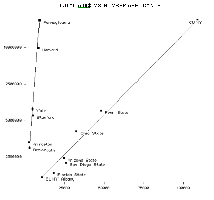
Ivy League: ( 11878452 - 3157221) / (9090 - 2823) = 8721231 / 6267 = 1391
Other: (11873611 - 1091110) / (108961 - 105 = 10782501 / 98 = 106
Note that these two slopes estimate the values in column X of the table (Total Aid Per Student).How do Ivy League schools listed compare for Endowment contributions to undergraduate student financial aid ?
Examination of budgets available on each school's Web site provides the following data:
School |
Endowment ($000) |
Contribution to UG Student Aid ($) |
Brown |
1,616,285 |
41,000,000 |
Dartmouth |
2,186,610 |
41,000,000 |
Cornell |
2,853,742 |
43,151,000 |
Pennsylvania |
3,393,297 |
54,247,000 |
Columbia |
4,208,373 |
64,620,000 |
Stanford |
7,613,000 |
67,000,000 |
Princeton |
8,319,600 |
16,531,000 |
Yale |
10,523,600 |
11,700,000 |
Harvard |
17,169,757 |
68,000,000 |
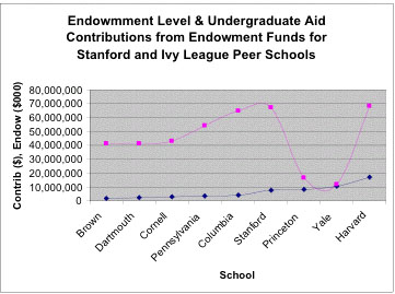
The graph shows that as endowment increases schools in this Ivy group contribute increasingly larger sums of endowment dollars towards undergraduate financial aid in five of seven cases. Princeton and Yale both contribute significantly less. Documents on Princeton's Web site claim that recent poor market returns is causing tight budgeting. However student aid is one of the few programs whose funding is unaffected.The prior year's funding from endowment is at the same general level. Yale's endowment investment return, at roughly 25%, surpassed all schools' in 2002. Further, they have the largest per student endowment of any school in the nation at $1 million.
Summary.
The data presented strongly suggest that these seven Ivy League schools do receive more government financial aid funding per student than poorer schools. The more surprising finding is that Princeton's and Yale's endowment contribution to undergraduate financial aid compares so poorly to their five peer institutions. Visits to the financial aid sections of both schools' Web sites reveals that their marketing materials tout need-blind admissions policies - students are admitted without regard to need. Once admitted, those in need will have 100% of their shortfalls met by the school. Two conclusions that can be drawn from observed data, however, are (1) Princeton and Yale serve fewer needy undergraduate students than their peers, and (2) Needy students admitted to Princeton or Yale can expect less support from endowment funds than at other Ivy schools.
Who is this fellow Myles McLeod?
I'm sure readers are wondering as we did: who is this fellow Myles McLeod? We asked him and learned that he has studied Engineering, Decision Sciences and Computer Science and has taught and worked in a variety of different areas. This experience has convinced him that he would like to contribute to the field of Biostatistics and so he has applied to do doctoral work at one of the leading Biostatistics Ph.D programs. We wish him good luck with his applications and look forward to more contributions from him.
Copyright (c) 2003 Laurie Snell
This work is freely redistributable under the terms of the GNU General
Public License published by the Free
Software Foundation. This work comes with ABSOLUTELY NO WARRANTY.